The 12th, 13th, and 14th Annual Contemporary Kobachi Artist Exhibition

I was away from writing for so long I missed 3 entire years of The Annual Kobachi Exhibition which I have written about since it’s 7th year. The reports from The All Japan Shohin Bonsai Association who holds the exhibition every year in January at the Gafu Ten are No longer available online(even with the Wayback Machine!). So I will have to piece together some highlights and hopefully the winners from each exhibition so there will be a record in English. I’m a day early with the weekly post today because I have another one for you later this week!

If you’d like to see articles about the previous exhibitions, check the “A Table of Contents” page in the Menu on mobile or on the the header banner on PC. Lots to learn as you follow the potters who have entered multiple times!


The 12th Annual Kobachi Exhibition

WINNERS!

GLAZED CONTAINERS

Gold Prie awarded to Kyoshi Koiwai for his 3 piece entry with wonderful glazes and lips. Perfect forms!
Detail of me favorite of the three. Outstanding form and glaze.
My second, but close, favorite. Wonderful and uniform micro crystals. An aspect of his glazes(his zinc crystals in particular) that he told me personally won him the bronze prize this month at the 2021 exhibition.
Silver prize winner for 2017 was Dokou(土交). I like the form on the mokko and the variety but, I really felt there were better entries this year and was surprised at this choice.
The Bronze Award for the 12th Kobachi goes to a longtime favorite of the blog(and my collection!), multiple Gold Award winner Shigeru Zyubei. His new work is outstanding, but it was an odd choice for him to enter all Taiko cascades.
Detail of the striated blue Cantonese style glaze Zyubei is famous for.

UNGLAZED CONTAINERS

The Gold Prize was Awarded to “Shouzan”(昭山). Both the technical form and Shudei vermillion red clay are outstanding.

A potter who I was not familiar with and could not find any information about took the silver award. Great series of mame pots, lots of variety and vibrant clay.
Tadashi Ono once again takes an award in the unglazed category, this time the bronze. Easily the best sculptor of his generation.

A rare .honorable mention was also given, although I am not familiar with the artist. All the pieces are variable in size, style, and technique, well deserved.

PAINTED CONTAINERS

The gold award for painted containers went to a potter I wasn’t immediately familiar with. Yoshikawa Itidou’s display is outstanding though(thanks to Alfred Tan for the name). A great variety of sizes, motifs, and shapes. A deserving award winner from the Itodou kiln.
The silver award in 2017 went to a friend of the blog whose work I’ve followed since he began posting on Facebook, Taiwanese artist Ruban Yu.The variety of painting and pottery techniques here is outstanding. Orange glazed with sometsuke sansui windowsand no window bleed, panel pdetailed ainted multicolor unglazed, and a an alarm overglaze enamel with outstanding details. A well deserved award.
A trio of sometsuke pots takes the bronze for female painter Syoko Kunii. Good variety of design, and excellent classical sometsuke graphic work.

OTHER NOTABLE ENTRIES

The nephew of popular and respected Bonsai potter Fukushige. In 2020 he goes on to win the Gold award. That’s real improvement!
Long loved by the blog, since he first appeared selling publicly, a great painted entry from Shunka Seizan. While I’m still most in love with his glazes, his paintings are rapidly becoming contenders for award.
As usual, an excellent and varied display from future and past gold award winner Shun. A little dark and classical, not the artist’s usual style.
Doshita Toyosei, special exhibition.
Doshita Keishin, wife of Toyosei, special display.
Shinobu trio showing the excellent glazes, forms, and unique details that this potter has become famous for.

The 13th Annual Kobachi Exhibition


WINNERS

UNGLAZED CONTAINERS

Tadashi Ono, bronze award in the previous year, and yet another Gold Prize to add to his others. The best sculptor of his generation, this years display showed excellent detail and varied clay color.
Haruhisa Totsuka wins the unglazed silver prize with a trio of varied rounds. His display in last years (2020) exhibition was one of my favorites.
The Bronze award for the 2018 Kobachi went to a potter whose name I couldn’t find. The display shows a great display of form, and excellent technical skill with such thin walls.

GLAZED CONTAINERS

Longtime love of the site Shigeru Zyubei takes gold prize with a trio of fantastically glazed pieces. I’ve written multiple articles about the artist, one of my favorites, so my opinions should be clear if you check the A Table Of Contents page!
The silver award went to Haruhisa Totsuka for a well varied trio of pieces. Different glazes, nice shape variety, good technique, and definitely deserving.
The variety of shapes, sizes, glazes, and styles on the bronze prize winner’s display, Yoichi Yoshida, is just outstanding. It was definitely one of my favorite displays in the exhibition.

PAINTED CONTAINERS

Yuuki Shoseki, well known daughter in law of pioneer female container painter Ishida Shoseki, takes the Gold in the 13th Kobachi for a trio painted very much in her signature, classical, bright style.
A fantastic display of Toshimine mame containers wins the silver award. A great display showing variety and detailed technique from a painter fast becoming well known in the West.
Ruban Yu takes the bronze at the 18th Kobachi. With a bronze and a silver in back to back to years, I don’t think we have long to wait before this Taiwanese artist takes home a gold award.

OTHER NOTABLE ENTRIES

Watanabe Ikkou special exhibition
Itoh Gekkou Special Display


The 14th Annual Kobachi Exhibition

WINNERS

GLAZED CONTAINERS

A surprising choice for Gold this year in the glazed containers, Taiwanese potter “Shung Cheng”(順成). Only the 2nd non-Japanese to take Gold Prize(the first being Andrew Pearson). The pottery itself is excellent, and she shows a great variety of technical skill and talent. Variable glazes, sizes, fancy feet: a worthy award.
American Roy Minarai became the second Westerner accepted in the exhibition and brought home a Silver Award in his first outing. Not too shabby for 3 years of bonsai pottery, putting America on the map in Asia where we have long been made jest of for our bonsai pottery!
I hated the photo they took at the exhibition, so I included a detail photo of Roy’s display of his award winning containers at the National Shohin Bonsai Exhibition in Charlotte, NC. The shitakusa, among other things, was Bill Valavanis’s idea, you can always trust Bill to come up with some of the best non-conforming display ideas, such as using a storage box as a stand for the Shinsha Yu glazed square. 2022 will definitely be Roy’s year for gold(if he does it right) 😉
A completely Unknown potter to me placed at bronze for glazed containers in 2019. Personally I thought there were better entries and this one escaped me completely. Although the pots do have a nice variety, the display is very crowded.

UNGLAZED CONTAINERS
Yoshiyuki Kawada takes the gold award in 2019! Fantastically carved containers, Kawada is fast becoming one of the top 3 carvers of his generation. Classical depictions of Raijin and Fujin, Japanese weather gods, grace avant-garde containers in this duo. The work he’s done since Beer, Wine, and Cheese banded together to buy him a kiln has been worth every penny spent, and then some! Quite the comeuppance given his former unpopularity! Congratulations Kawada San!
A great unglazed silver award entry from Shunpou. Much improved from his entry in the 13th exhibition. His work, in both shape and rustic clay, as well as technique, shows slight reminiscences to Syuzan and Senshu.
An excellent trio of pots takes the bronze from a potter I was unfamiliar with, Itsuho, Tada Kenta. Great bi-color clay rounds.

PAINTED CONTAINERS

A much better photo than the one from the exhibition. The gold award at the 14th Annual Kobachi Exhibition went to Hiroshi Yanagawa. The level of detail and technical craft in these pieces is unbelievable. Very Chinese in style, different and more archaic than the Southern Hanga style we often see imitated by Fujikake Yuzan and Joshu Katsuyama. These express a level of skill and technique not seen in decades…or maybe longer.
Speaking of generations of talent, this photo is pretty cool. On the left is Hiroshi Yanagawa standing next to one of his teachers, the grandson of the great Yusen, Tsukinowa Shosen. Hiroshi Yanagawa’s Gold Winning Painted Display is between them.
Martin Englert took home the silver prize for Germany and the EU, another win in 2019 for the West! What a wonderful trio of containers! Congratulations Martin, the best painter of his generation working in the Western world!
Another relative unknown, with a potter’s name that appears to be “Yo”, takes the bronze prize in 2019. A trio of charming rounds depicting classical images from the chojugiga(see article on blog in A Table of Contents). Traditional depictions seem to always be a judge favorite, a literal classic.

OTHER NOTABLE ENTRIES

Watanabe Ikkou Special Display of over 30 pots. I once had a respected enthusiast tell me Ikkou made production pots….they don’t give out 30 pot special exhibits at the most renowned Shohin pottery exhibition in Bonsai for production work!

I hope you’ve enjoyed this look at the three Annual Contemporary Kobachi Exhibitions I missed while on hiatus. I definitely missed a few details, but hopefully I’ve provided somewhat of a record for those of us in the Western World.
Thanks for Reading!

Advertisement
Posted in Uncategorized | Leave a comment

A Quick Look at Really Bad Forgeries, or, Exposing The Man Behind the Curtain

It’s almost common knowledge these days that there are many forgeries of Japanese potters’ work. I’ve even heard some claim that there are more fake pieces than real containers when it comes to some of the top level artists. The truth is, I think, that these claims are highly exaggerated in the West. While I often see forgeries, I see far less than some would lead you to believe, and almost always they are glaringly obvious. For starters, an overwhelming majority of the forgeries that do exist are only of top tier artists. It’s exceedingly rare to see a forgery of an item that can sell for less than $500. Nobody is out there cranking out fake production Yamaaki or Koyo containers, they’re making fakes of Tofukuji, Yusen, Gekkou, and other high end and top shelf potters.

The sole detail that appears legitimate on this piece is the artists’s mark. These are the easiest parts of a container to forge, so should be the last thing you look at for authentication.
A forged Heian Tofukuji I received in a purchased lot of a dozen pots as a surprise. Obviously fake, it cost me around 20$, even though I didn’t know I was buying it. Worth it, great teaching tool.

The main culprits of the proliferation of this diabolical BS today are auction service sites like Buyee and other drop ship eBay-style auction services. In the 80’s in Japan the forgery boom was the result of the huge amount of wealth flowing into bonsai from the economic boom years, back when you couldn’t throw a fake Tofukuji without hitting another fake Tofukuji! Now, of course, it’s the internet. These sites used to provide access to a great service, years ago, but now the Asian auction sites have become overrun with garbage, rip offs, broken and forged merchandise, and thieves.  DO NOT BUY there without checking with a reputable dealer or appraiser on what you are buying. You have no recourse overseas if you buy a forged Isseki from an auction site in Japan, Taiwan, or China, you’re just out 5 grand.

I’ve collected images of a few examples recently that I saw for sale in Taiwan, China, and Japan. These should illustrate, as the above Tofukuji with its absolutely atrocious attempt at the artist’s work, how much the problem is overblown. This is certainly true for buyers of mid to high level show pots, containers costing $500-1500(unless those containers are lower end pieces from top shelf potters, like a tiny Tofukuji or Daisuke accent or mame pot). Collectors and investors at the top shelf level have to be much more careful.

So today we’ll look at some of the more commonly forged artists, with examples, that show that forgery is not nearly the problem it was in the 80s and 90s in Japan. With a few simple tips, and a good authenticator or appraiser to help you with purchases, you can buy with confidence in today’s market.

ALL OF TODAY’S CONTAINERS WERE AVAILABLE FOR SALE ONLINE WITH SHIPPING TO THE WEST FROM TAIWAN, JAPAN, AND CHINA.

ITOH GEKKOU

I’ve placed a link to my article on each of the artists work at the beginning of their section, so you can familiarize yourself with their work and easily see the differences being highlighted.
LINK TO REAL GEKKOU:
https://japanesebonsaipots.net/2012/06/21/finally-itou-gekkou-2/

A Forged Itoh Gekkou I found for sale in Taiwan. Everything, literally everything, is wrong with this container and screams fake. The painting style, technique, motif, shape, construction, Chinese even the signature are all at odds with Gekkou’s work. This was $50 US in Taiwan….it sold. And I guarantee it made its was to an online auction site in Japan and probably now resides in the West! Buy from reputable sellers!


Another forged Gekkou showing an atrocious paint job that has nothing in common with Gekkou’s style. The bleed of the strokes is especially unlike Gekkou’s painting technique.
This one is a little harder. The painting work is not bad, a classical Arabesque motif, although not a style normally seen from Gekkou, but not too unusual. We can really see that there’s a problem when we flip the piece over. Not only is the color of the underside dark, it’s uniformly dark. Patina doesn’t build like that on the bottom. This technique is often seen on fakes where the forger takes an old painted pot similar to the artist, and then paints on a signature with a very low fire glaze paint. This is likely one such example of that technique.
Herds another one where everything is all wrong. The shape, the thick glaze, the window border style, and the painting itself, which is nothing like Gekkou either stylistically or technically.

This one is also a little harder, most of the others look cheap even to the untrained eye. The one thing you should notice first about all 3 of these fake Gekkou landscape scenes is the lack of birds. Almost every Gekkou Sansui(mountain and water landscape) will have a flock of birds flying in formation. Not all Gekkou have them, and not all forgeries don’t, but the overwhelming majority of authentic and fake Gekkou differ here. No birds is a sign to look closer. In addition, the landscape painting itself is lacking in detail and has some bleed. The color of the sometsuke Blue glaze paint is also FAR too light.

Real Gekkou. Look for the birds first.

HEIAN TOFUKUJI

LINK TO REAL TOFUKUJI: https://japanesebonsaipots.net/2011/06/02/the-unglazed-pots-of-heian-tofukuji/ https://japanesebonsaipots.net/2011/05/25/glazed-pots-by-heian-tofukuji-part-two/

One often sees additional details on forgeries that would make a pot special. I guess the thinking goes, “why would a forger go the extra mile to make something unique for the artist?” In this case he’s initialed something in addition to the stamp. The stamp itself, however, appears drawn, not impressed. Nail carvings displace slip around the lines in a different manner than a stamp. It’s possible it’s just a bad impression, but not a good sign. Mostly, the clay color is off, a very strange one to see from the artist. The pear skin isn’t uniform, only on the outside, not the bottom or inside. On real Tofukuji we usually see grog throughout the clay body
The clay, color of the Cantonese style Ruri glaze, and method of foot attachment, and drain holes are all dead giveaways for this fake. The construction style is also far too clean. That’s not to say that Tofukuji was sloppy, rather that his style has a rustic warmth. More than anything, the stamp is totally wrong.
This is the easiest one of all. Only ONE of these painted catfish pots exists. There are no others like it made by Tofukuji, yet it is still on of the most frequently forged pieces in existence. The original is 9.5 cm. This is 9.7 cm. An easy fake to spot!

TSUKINOWA YUSEN

LINK TO REAL Yusen: https://japanesebonsaipots.net/2013/03/09/tsukinowa-yusen-part-1/


Here’s another example of a piece that is wrong in just about every way. The colors are all wrong, way too bright for the blue and green. The leaves on the tree in the foreground are stylistically wrong, and the background details are amateurish dots. It’s an OBVIOUS forgery.
which brings us to our next point.
You cannot trust a hand signature, nail carved, on a Yusen, or any other artist for that matter. These days, enterprising forgers are finding old, high quality containers that resemble the work of famous artists and cutting the signature in with a CNC machine. As this is done from a scan of a real signature, there will be no visible difference, it will be perfect. The only way to tell is in person. Signing a pot displaces clay, and even the best of artists don’t clean up well enough to eliminate all of that displaced clay along the lines of the characters. You have to rub the signature. You’ll feel the displaced clay. A CNC machine will be perfectly flat around the lines and also have perfectly uniform depth.

Another very obvious one likely also signature cut by CNC. For starters, the vast majority of Yusen containers are carved from a single block of clay(kurinuki), while this is slab or coil built. The detail is sorely lacking to the painting, it’s amateurish, and there is no decorated design on the feet. The signature, again, looks fine but sloppy.

A much nicer example. There were two things that first gave me pause when I first saw it. First, despite being tiny, I see no obvious tool marks from single block carving which are common for Yusen on the interior and underside. And second, it’s extremely unique, top and bottom yellow glaze with full wraparound landscape scene….well that should be very very expensive….and it was 500$. The painting itself is lacking as well. The leaves are too larger for Yusen work, the thatched roofs lack gradation detail, the background conifers are amateurish, and there is no one in the main house(Yusen sansui almost always have a figure in the main hut, unless the figure is elsewhere).

Similar to the blue and red above, everything is wrong with this one, for all the reasons mentioned in these other forgeries. The painting style is unlike Yusen, and amateurish at best.

Another example of a likely older piece of regional pottery that was forge signed using a CNC machine. The motif is a classic one, but totally unlike the real classical dragon motifs painted by Yusen.

A real Yusen painted with classical dragon motif. The difference is striking. There’s no comparison between the levels of skill of these two artists.

SANO DAISUKE

LINK TO REAL Daisuke: https://japanesebonsaipots.net/2012/09/21/sano-daisuke/ https://japanesebonsaipots.net/2013/12/26/daisuke-sano-hiroshige-and-the-53-stations/

Another one that was way too cheap and too unique so made me pause for another look. While the designs aren’t uncommon for Daisuke, they’re more common from his friend Konno Shinzan, often called his brother, and the piece is unsigned. Could be Shinzan, but unsigned and unmarked, and sold as Daisuke, that’s as bad as if it were a definite forgery.

This one is supposed to be later Daisuke work. If you looked back at the two articles in the links above, you know as well as I do there is no way Daisuke painted this. Daisuke was the master of the crowded pot. Negative space has to fight for room in his pieces. This container is almost a study in minimalism. And it was too cheap.

Miyazaki Isseki

You can see another post I wrote on this matter featuring Isseki, Ino Shukuho, and Yusen at the following LINK: https://japanesebonsaipots.net/2013/06/19/fg-forgeries/

Descriptions of those forgeries can be found at the link. Here is an especially egregious Isseki.

All of these Pots in this article were Cheaper than they should be. CAVEAT EMPTOR. Let the buyer beware. While the bonsai pottery market Is MUCH safer than it is often rumored to be in the West, there are still shady sellers willing to take advantage of the emerging market that the West has become. I’ve seen several handfuls of forgeries purchased from online from these sites in America and Europe by buyers who didn’t know enough to buy in a high end art market without help.

If you want to collect and invest in higher end pots, there are a few things you should do.
1. Get an authenticator/appraiser. They charge, but it’s better than getting ripped off. 2. Buy from reputable sources. Sources that are not only reputable among enthusiasts, but among dealers and appraisers. There are people who sell shady merchandise that are well thought of.
3. Study. Learn as much about the potters and pots you love as you can.
4. Find out what you love. Collecting pots is no different from bonsai. At first you want some of everything. Study first, to find where your tastes truly lie, then start to buy.
5. Use your best pots. And grow bonsai that deserve them. This is where these hobbies truly intersect, otherwise they’re mostly separate; your love of bonsai will improve your pottery collection, and your love of pottery will improve your bonsai.

I’ll be trying to update with a new article every Monday, with occasional surprise articles on other days.
I hope you’ve enjoyed reading my first regularly scheduled published article and learned a little something.

THANKS FOR READING!

Posted in Uncategorized | Leave a comment

Getting Sexy with Pots(Part 1)

After a very long health related hiatus, I figured this first post should be something sexy….real sexy…..That’s right! We’re going to discuss “sexing” Bonsai containers today.

Alas, we won’t be discussing the collectible and risqué designs of Nick Lenz, Dale Cochoy, or Jim Barrett. Rather, we will discuss the qualities that make a container either strong or elegant.

Let us begin with a caveat and a trigger warning: I am fully self aware that this dichotomy is sexist, archaic, and, in the end, unnecessary. It is the common terminology of use in bonsai in Japan in multiple fields of visual art. That I dislike the terminology doesn’t change the fact that it is the terminology we use when talking about both bonsai trees and containers.

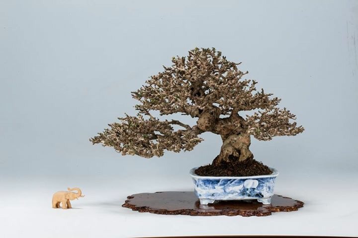
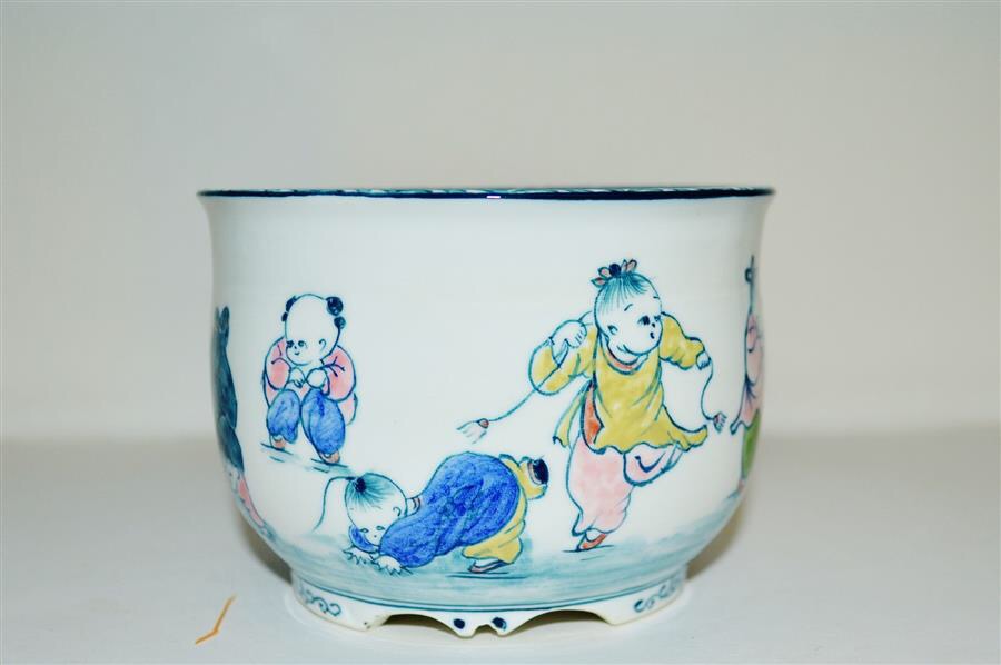
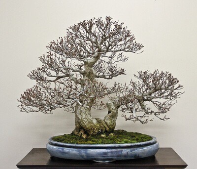
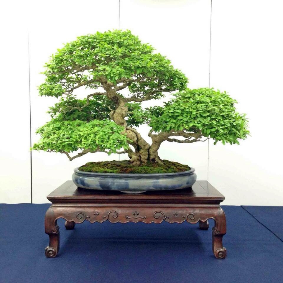
What do we mean when we talk about the gender of Bonsai containers. Is the above Buna (Japanese Beech) raft style Bonsai masculine or feminine? The container? All containers are to varying degrees masculine and varying degrees feminine. There aren’t really any containers that are 100% masculine or 100% feminine.

They each have a ratio of masculine to feminine qualities, just like our bonsai trees. Once you’ve decided on non-gendered issues like size, height, and color, figuring out that mixture of additional masculine and feminine components is an excellent and simple method of matching a bonsai to the right container. Say you have a tree that’s “mostly masculine” but has some “distinct feminine features.” Then let’s start looking for a container that’s 75% masculine and 25% feminine.

Please remember, this is very subjective. Assigning numbers and percentages to these qualities is more a feeling than legitimate mathematics.

Standard Masculine Features

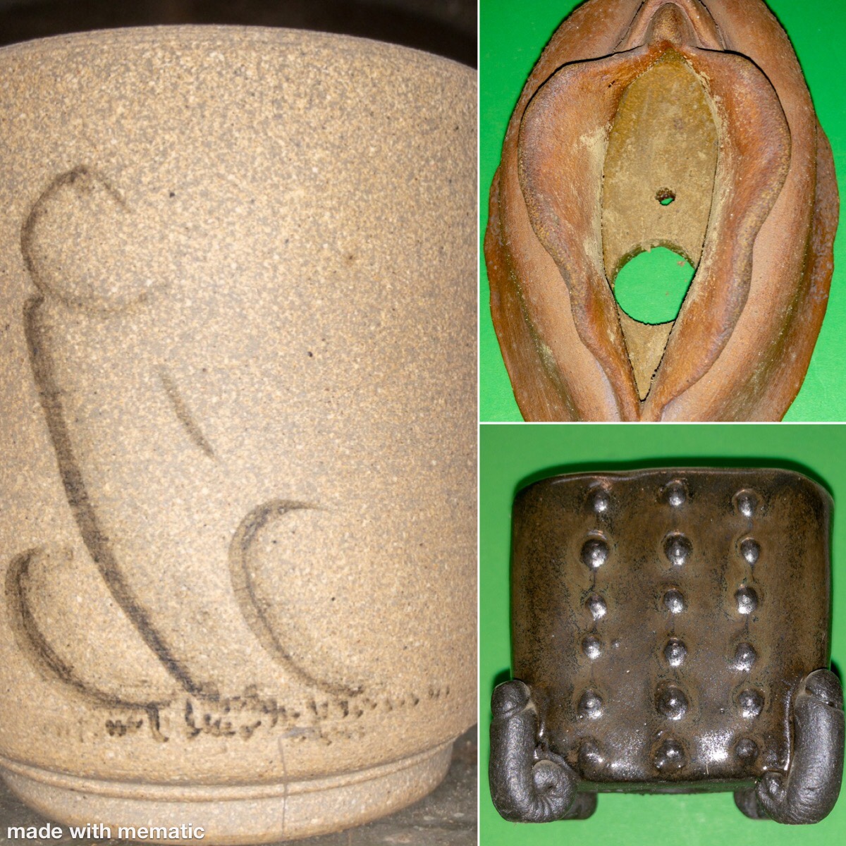
  • Shapes: Square, Rectangle, Mokko, Polygon(hexagon, octagon, etc.)
  • Taller height
  • Angles
  • Cut feet, stepped feet
  • Rivets
  • Straight walls
  • Sharp angular outer lip
  • Offset panels
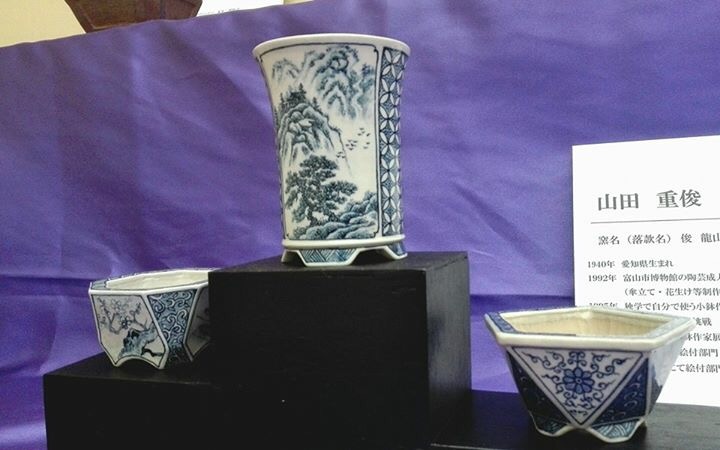
  • Most carved decoration
  • Cut corners

Standard Feminine Features

  • Shapes: Oval, Round, Fukuro, Rinka
  • Shallower height
  • Soft edges(rather than angles)
  • Fancy Feet, cloud feet, chicken feet, Cats Paw feet, etc.
  • Both concave and convex walls
  • Decorations such as braided rims,
  • Most lips
  • Inset panels
  • Most painted decoration
  • Sashes and bands
  • Incised corners

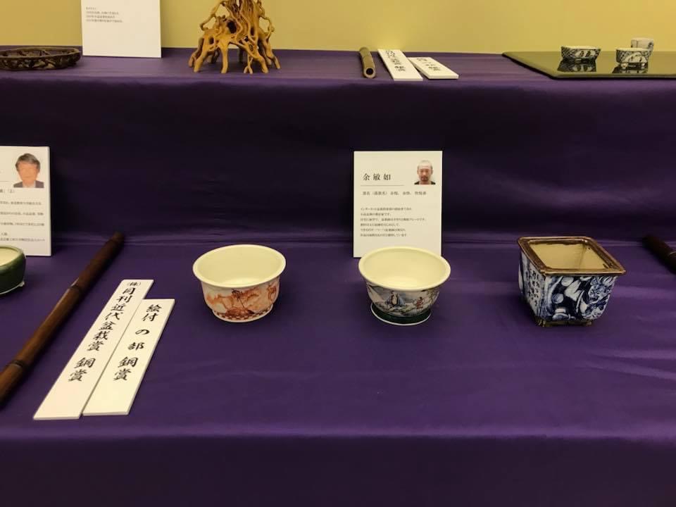
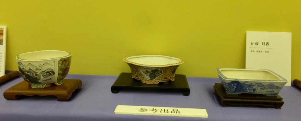
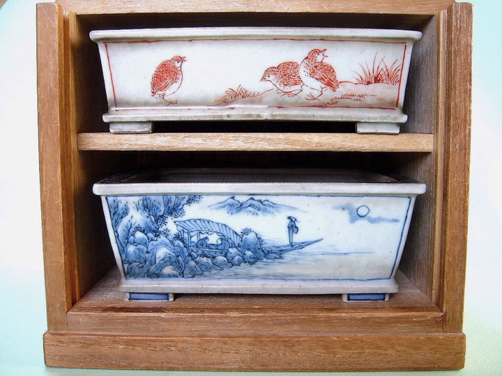
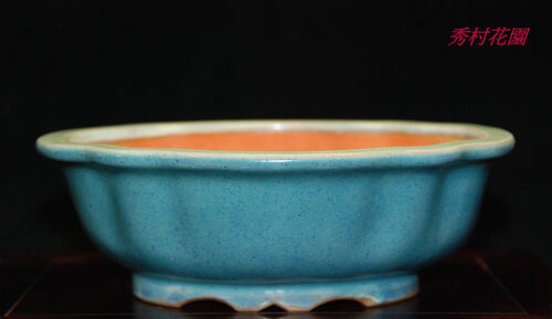
Let’s look at some examples and see what we’re talking about.

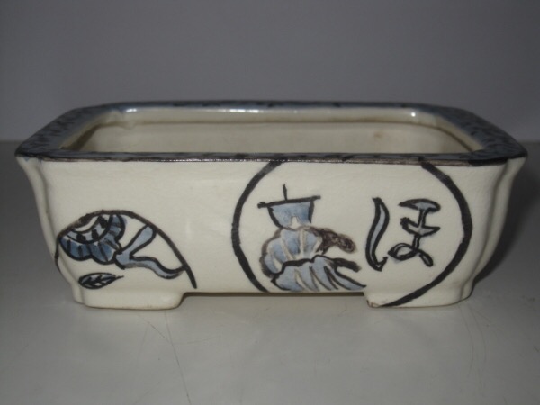
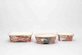
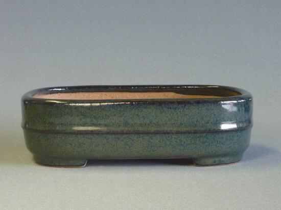
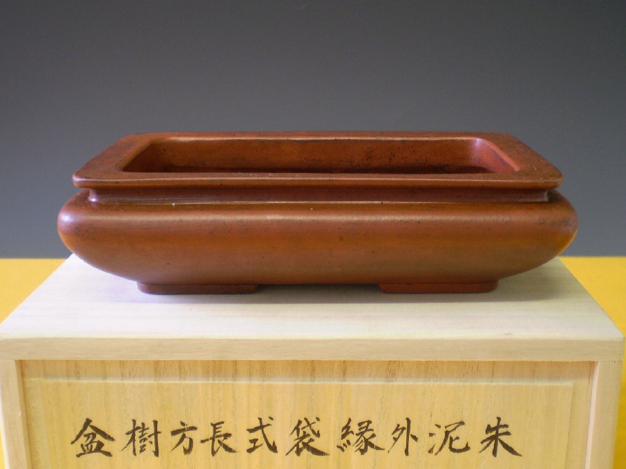
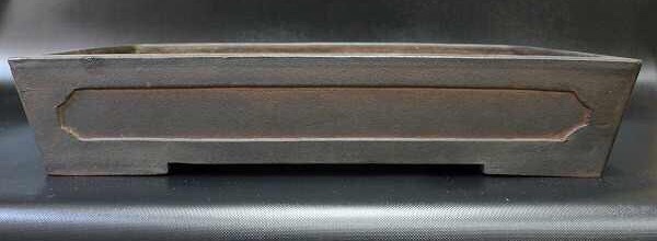
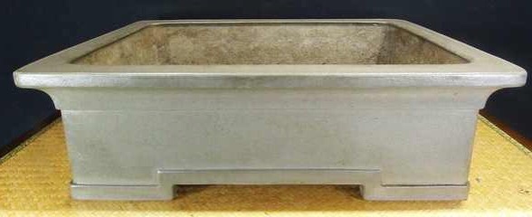
A basic lipped rectangle with thick walls, sash(obi iri) and cut feet. While the lip and it’s softer angles and the wide sash are feminine features, this is most certainly a masculine container.  Almost totally masculine.

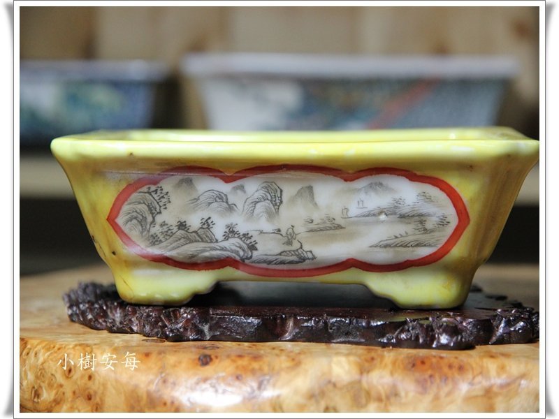
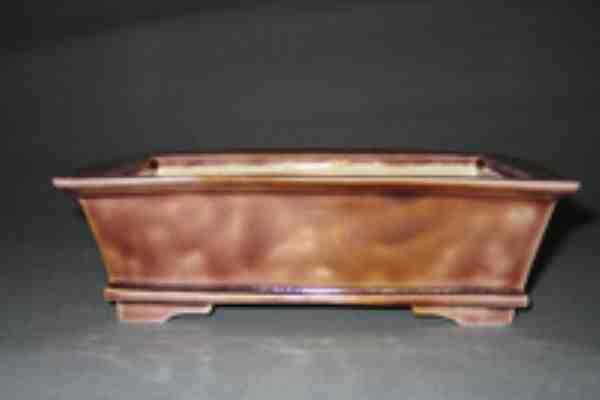
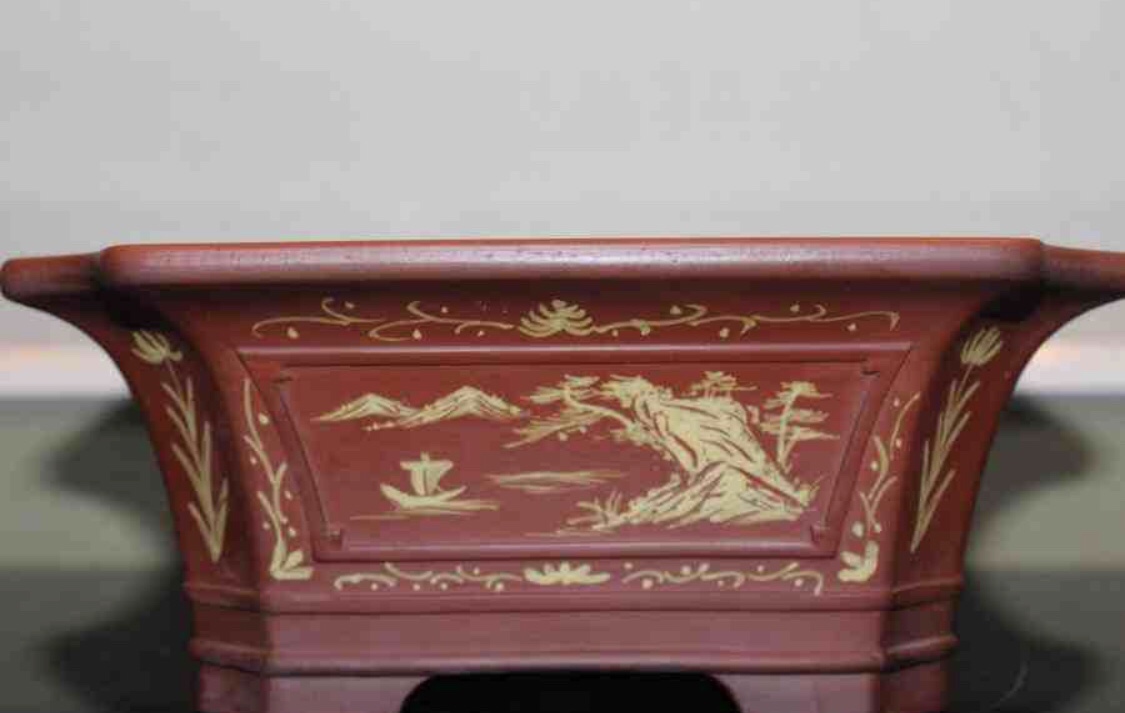
A totally different rectangle. While the basic shape, offset panel, and angular feet are masculine features, everything else is feminine. Painting, rounded edges, inset corners, lip, and bottom band. The shape still plays the lions share of determining gender, so this is still a masculine rectangle, but suited for a tree with grace as well. Maybe 70% masculine and 30% feminine.

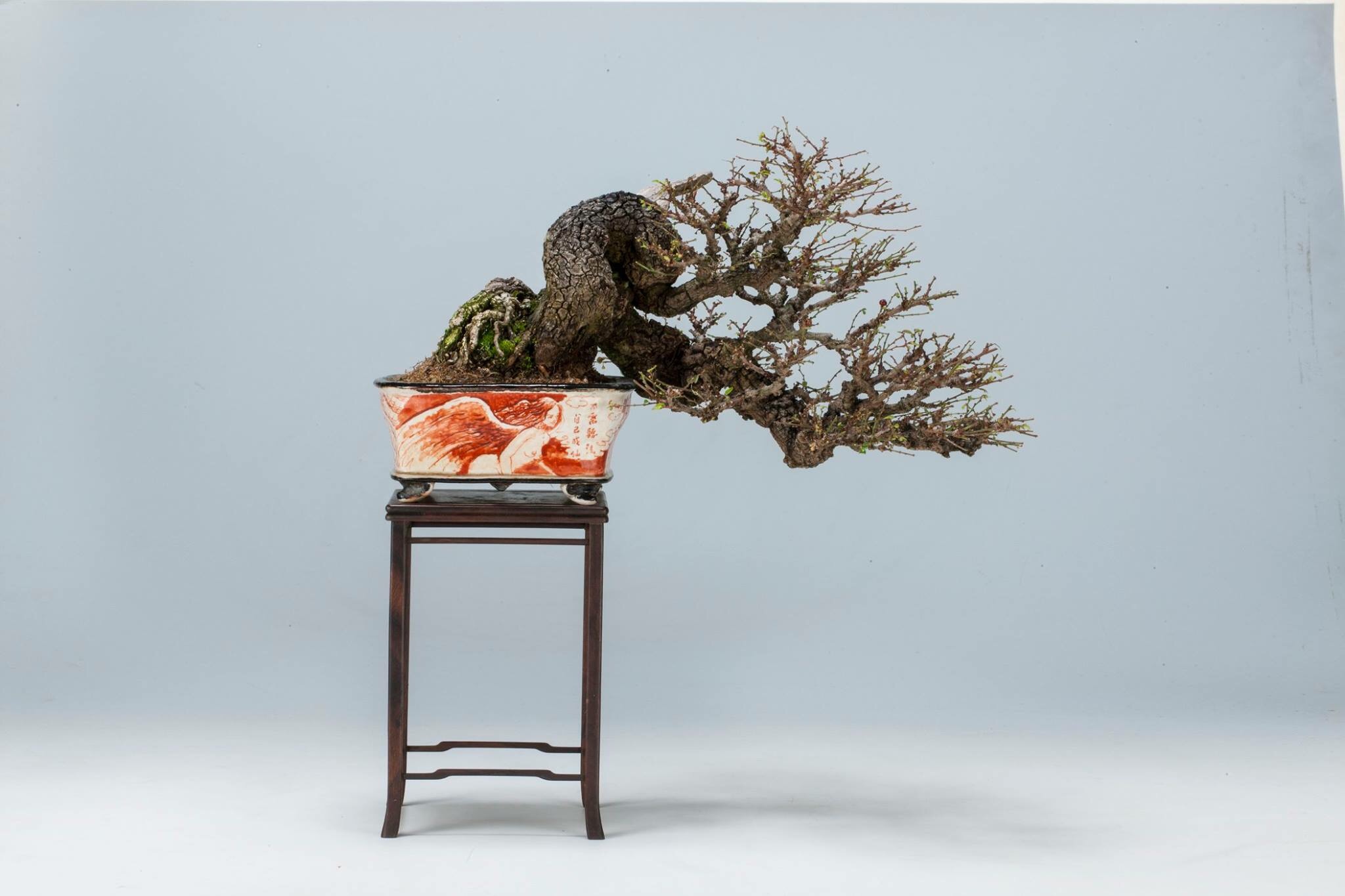
What would you put in a pot with that ratio?
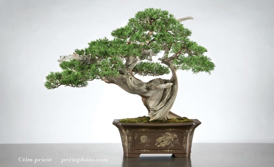
Masculine and powerful trunk, deadwood, and striking jin. The deadwood and trunk, the main features, hold up to the masculinity of the rectangle shape, angular feet, and offset panel. At the same time, the movement of both the trunk and the Jin is elegant and graceful and plays a big role. A perfect fit: 70/30 tree with a 70/30 pot.

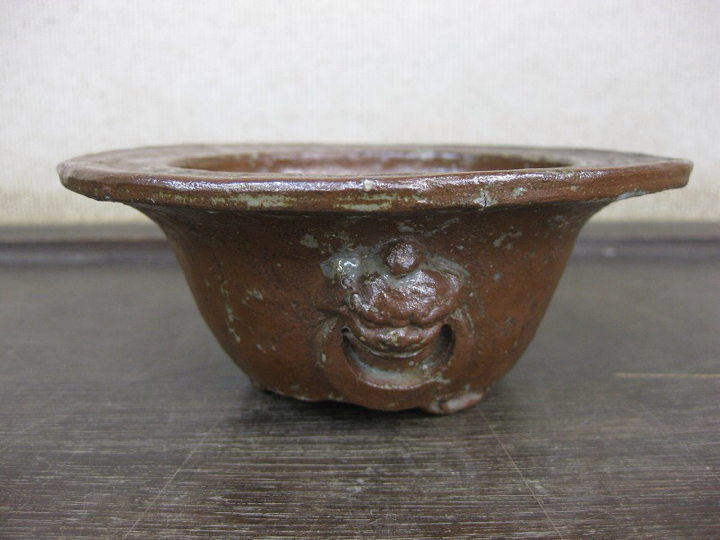
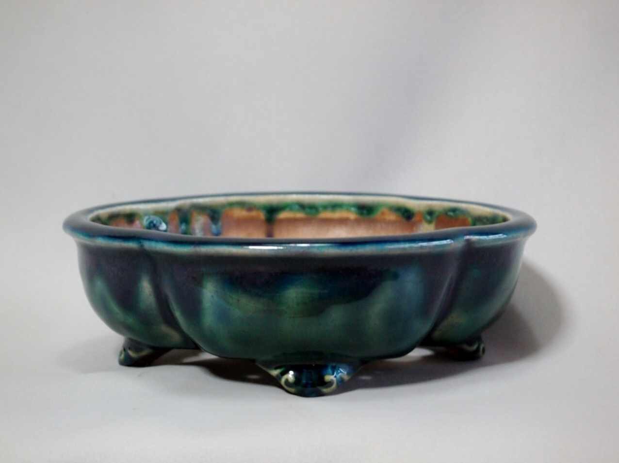
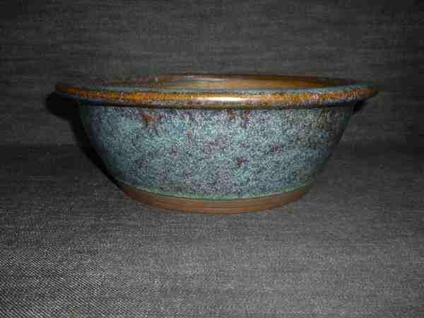
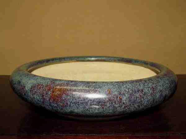
How about a comparison of two Tofukuji rounds. The first is rustic and rugged, very masculine for a round with its matte finish, carved decoration, and thick walls. A Very masculine round. 70/30•M/F

The next round, despite having masculine features like sharp edges, is all grace and elegance. Recessed Cloud feet, burnished finish, inner lip, and a slight wabi sabi wonkiness that make for a very feminine round with just a little masculinity. 90/10•F/M

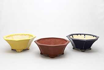
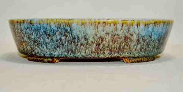
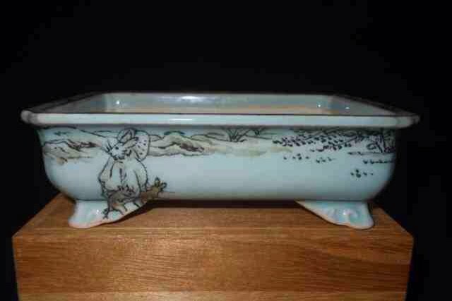
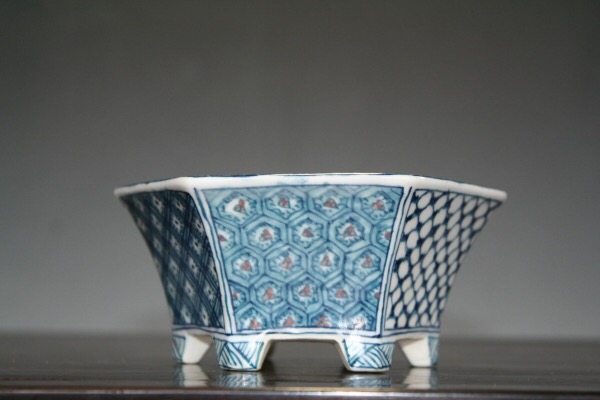
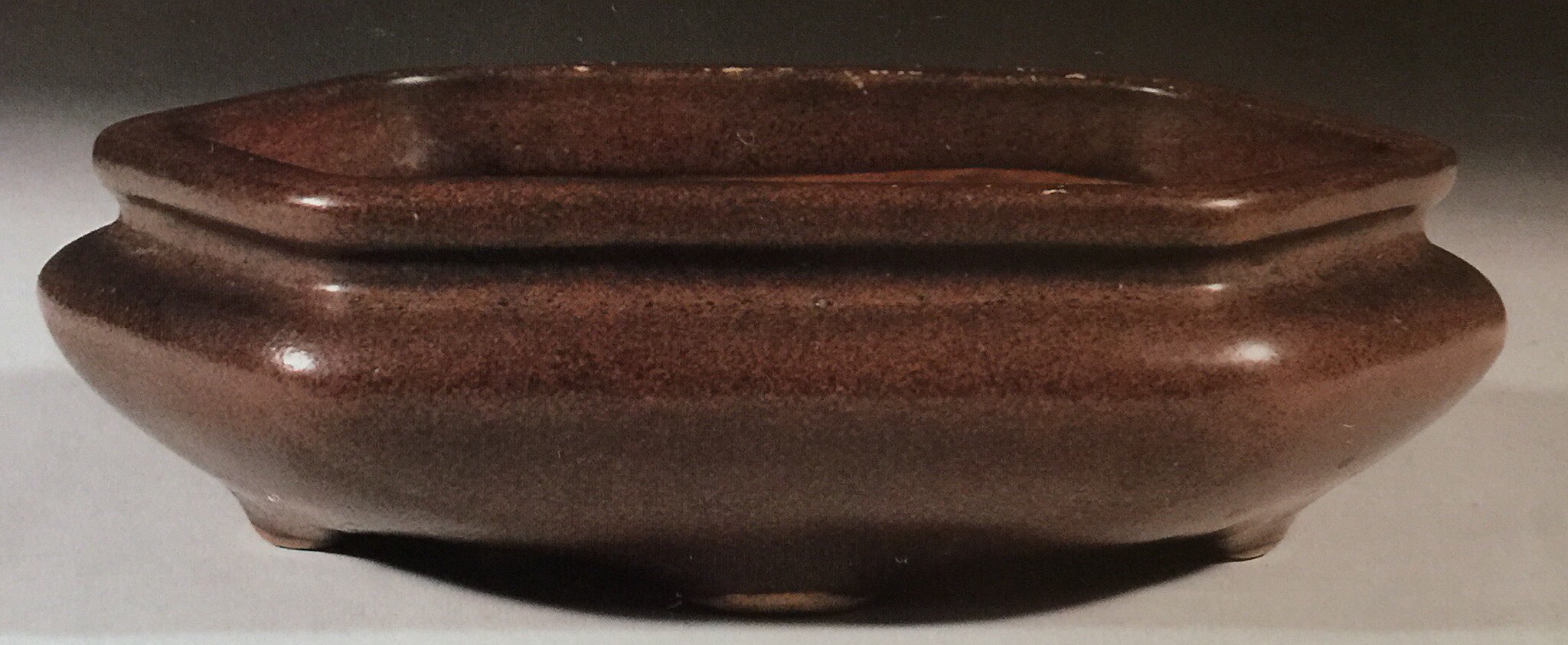
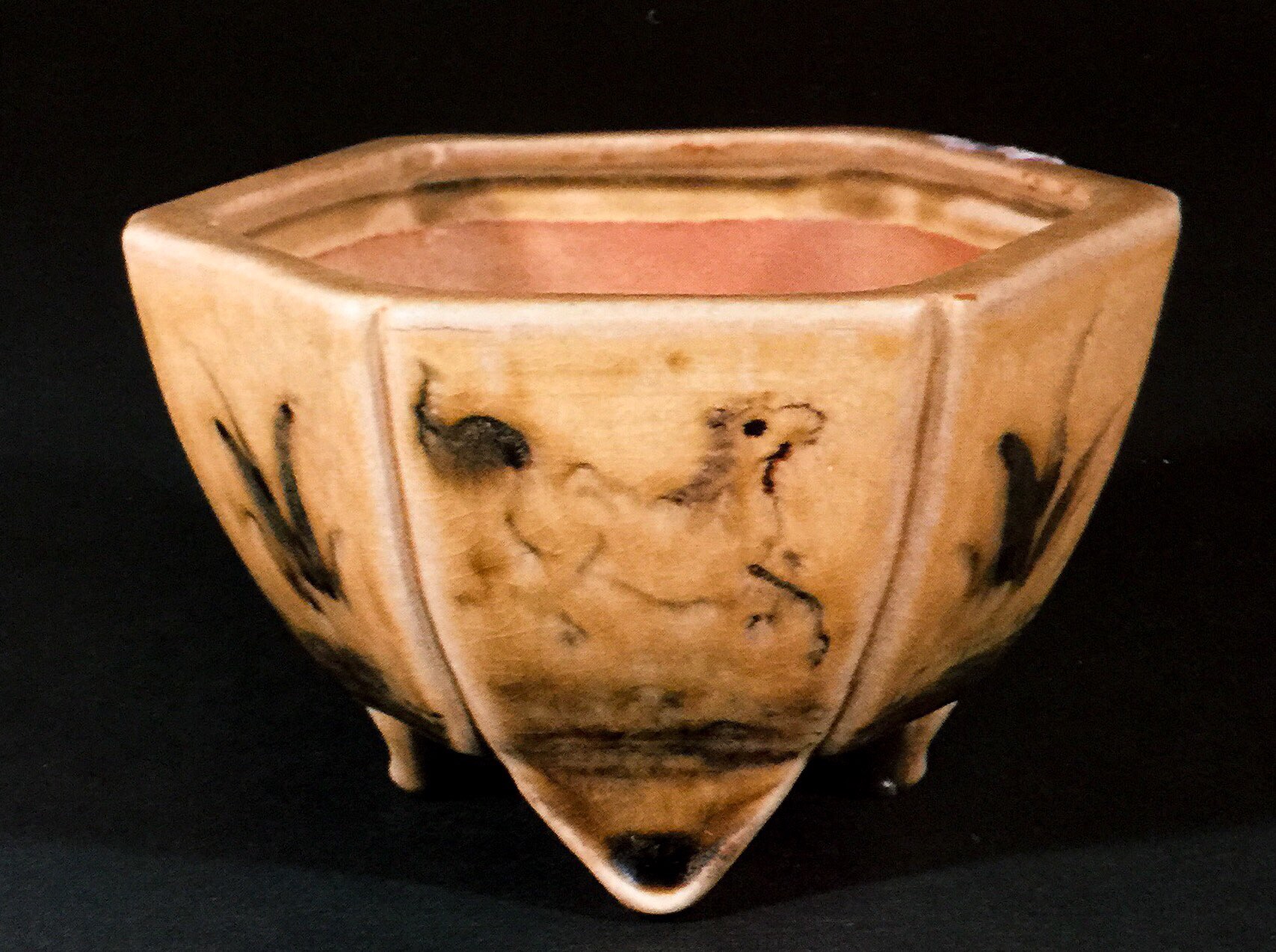
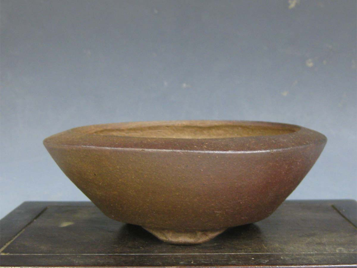
A deep mokko, almost oval, from Koushousen Yamaaki. The oval shape and lip are feminine, but the depth, feet and mushikui decoration are masculine. Suitable for a powerful informal upright pine with elegant movement. 80/20•M/F

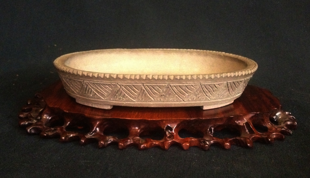
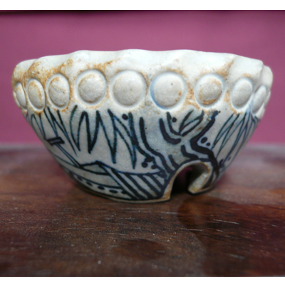
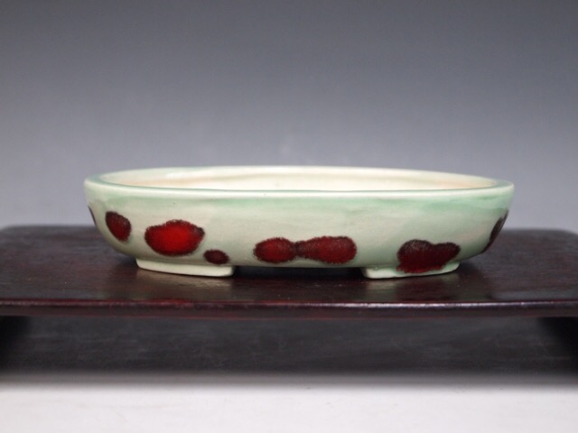
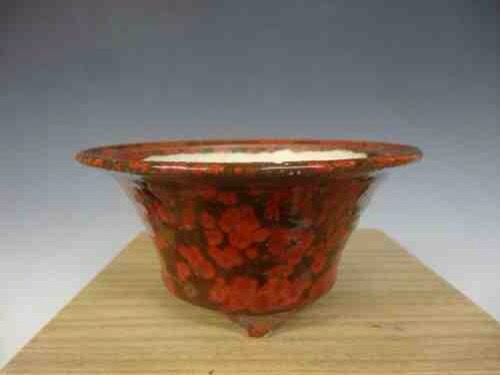
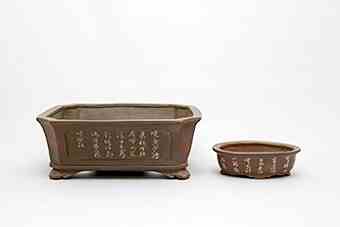
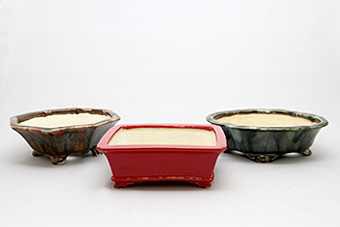
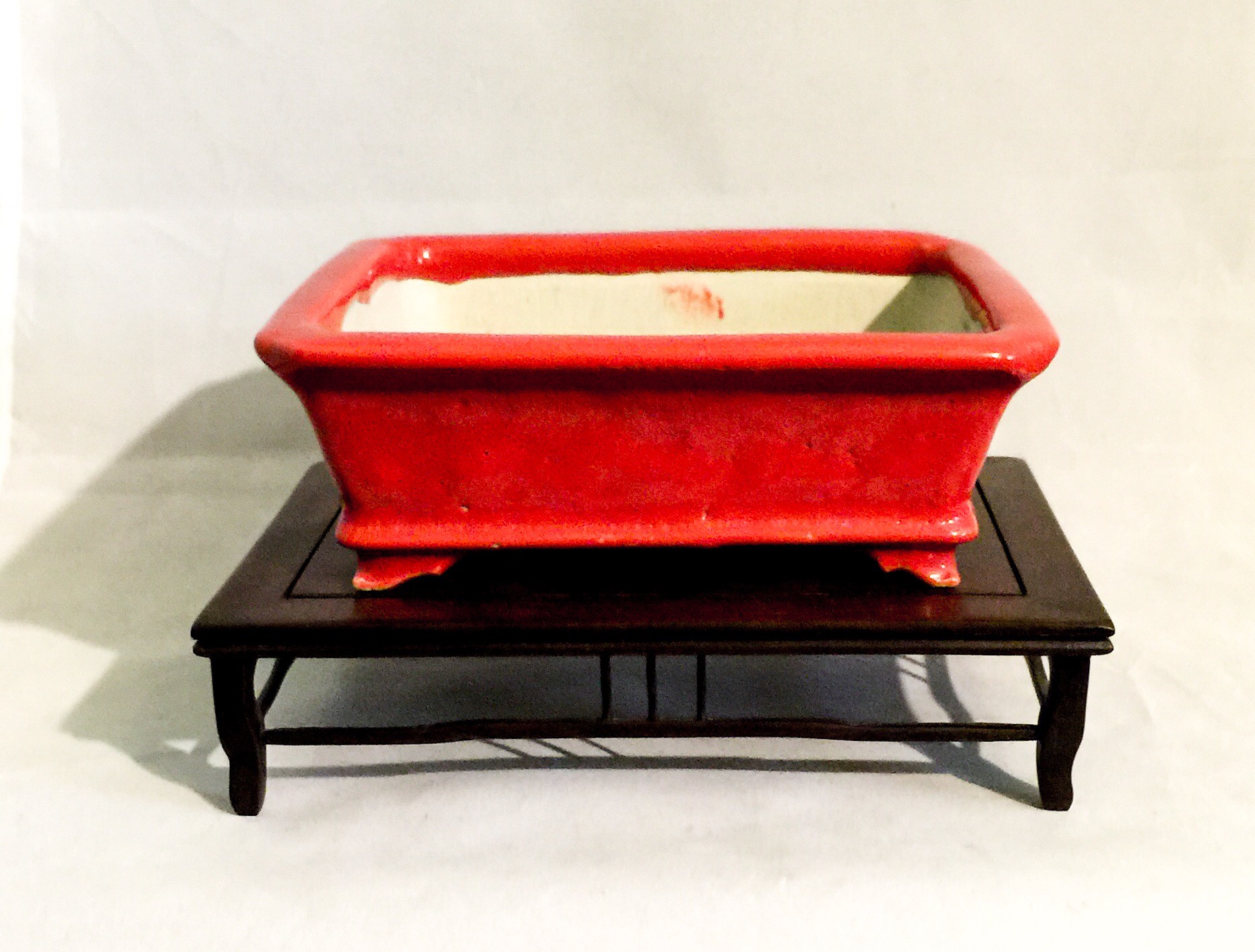
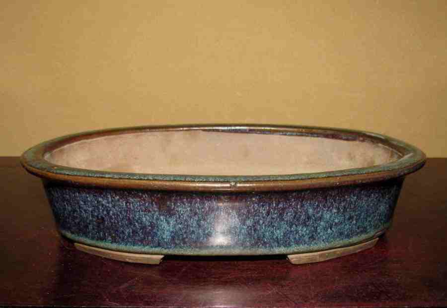
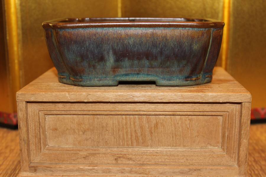
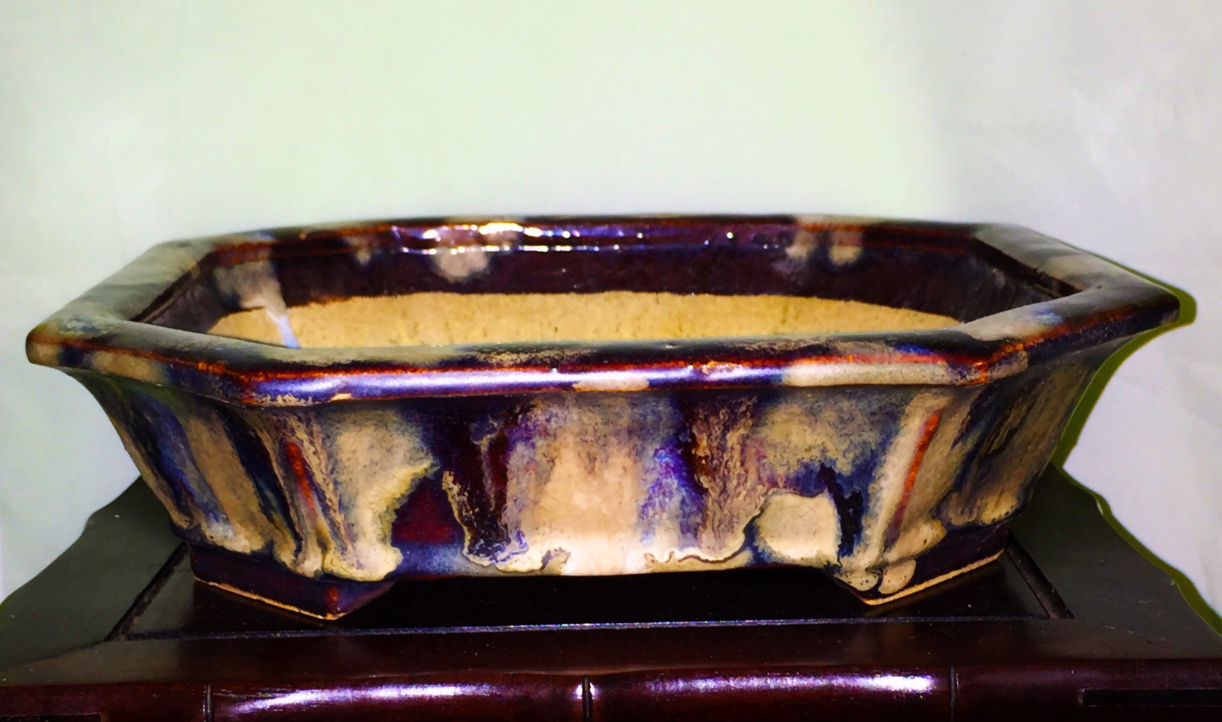
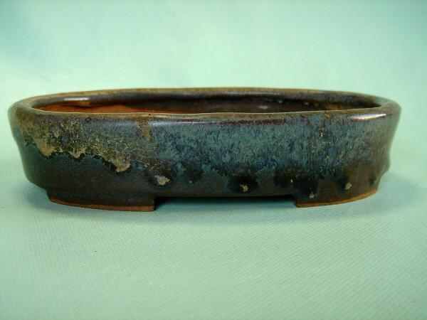
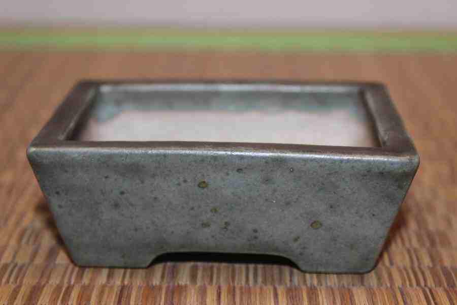
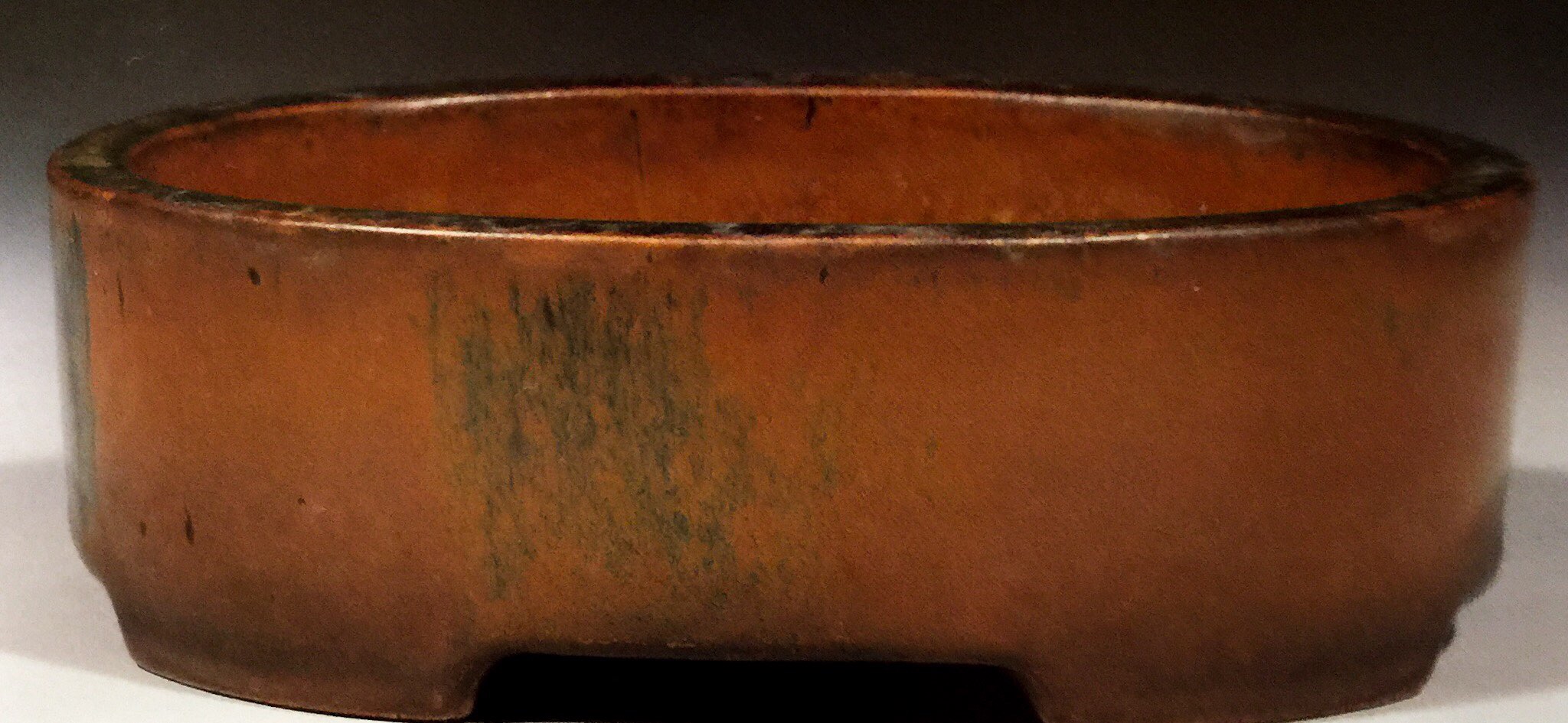
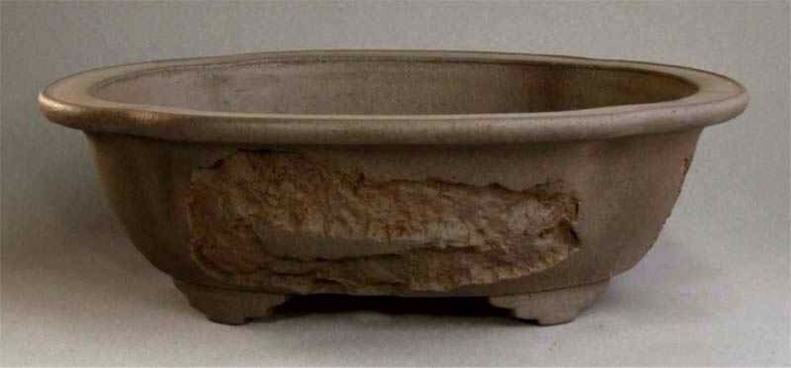
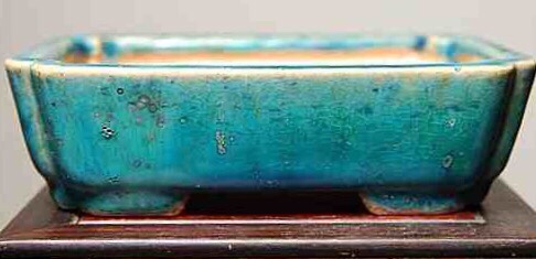
This old Chinese Shudei is a 50/50 split to me. The shape is masculine, rectangle, but the lip, inset feet, indent band, highly burnished finish, and convex and bowed walls are all feminine features. A rectangle in drag. 50/50

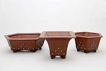
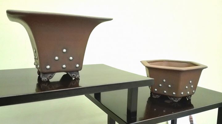
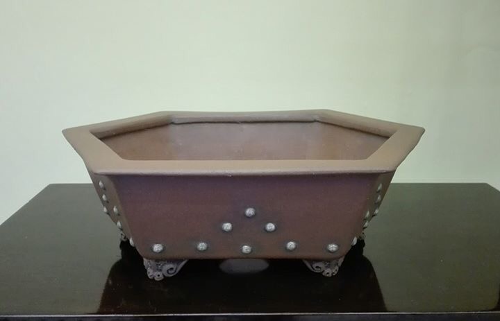
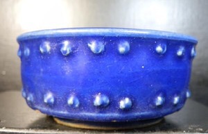
A definitely masculine pure silver riveted hexagon from Andrew Pearson of Stone Monkey Ceramics in England. While the feet are ornate and feminine, and the silver color to the rivets is more feminine than usual clay rivets, this is a clearly masculine pot. when the rivets tarnish, it will be even more masculine. 90/10•M/F

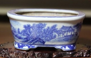
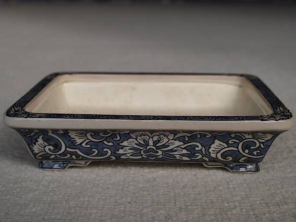
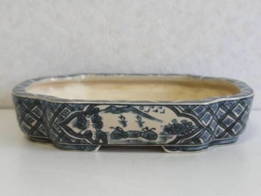
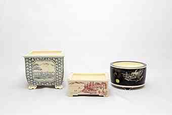
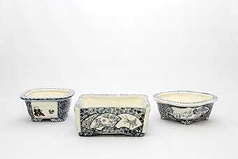
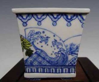
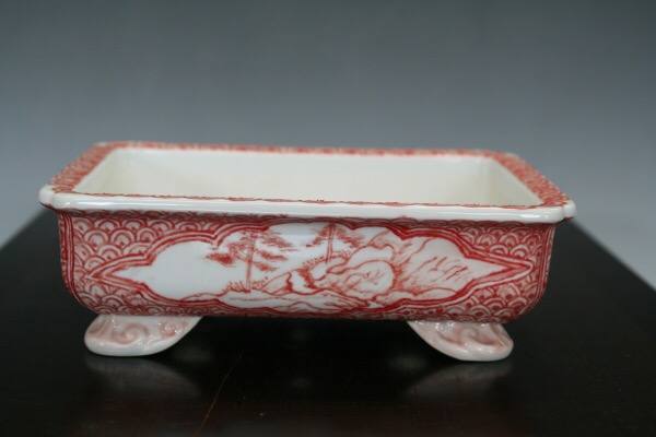
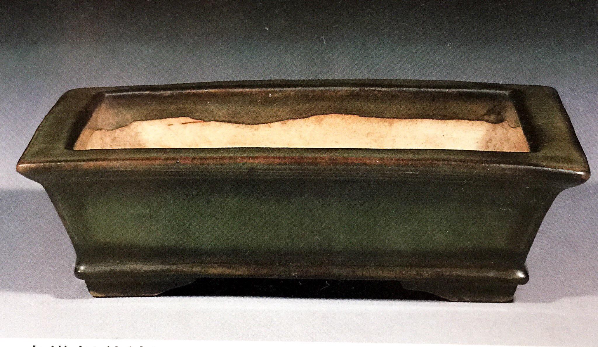
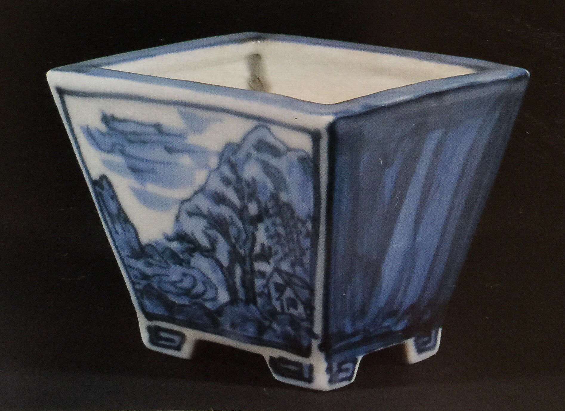
A pair of rectangle Tsukinowa Yusen. Everything about these pots other than the painting and slight outward slope to the walls is a masculine feature. Nonetheless, they’re fairly feminine pots. It’s easy to imagine a fairly delicate flowering Shohin here with elegant movement but a powerful trunk. 60/40•M/F

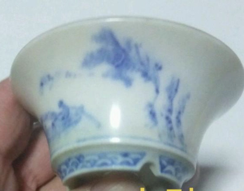
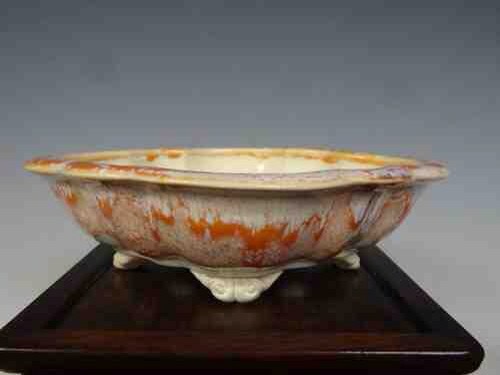
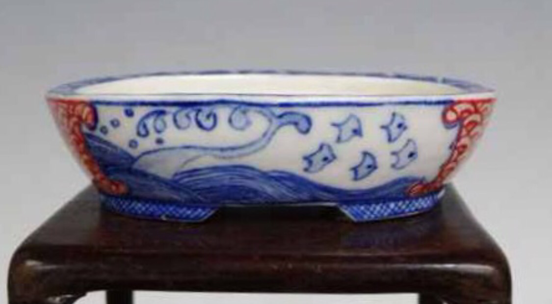
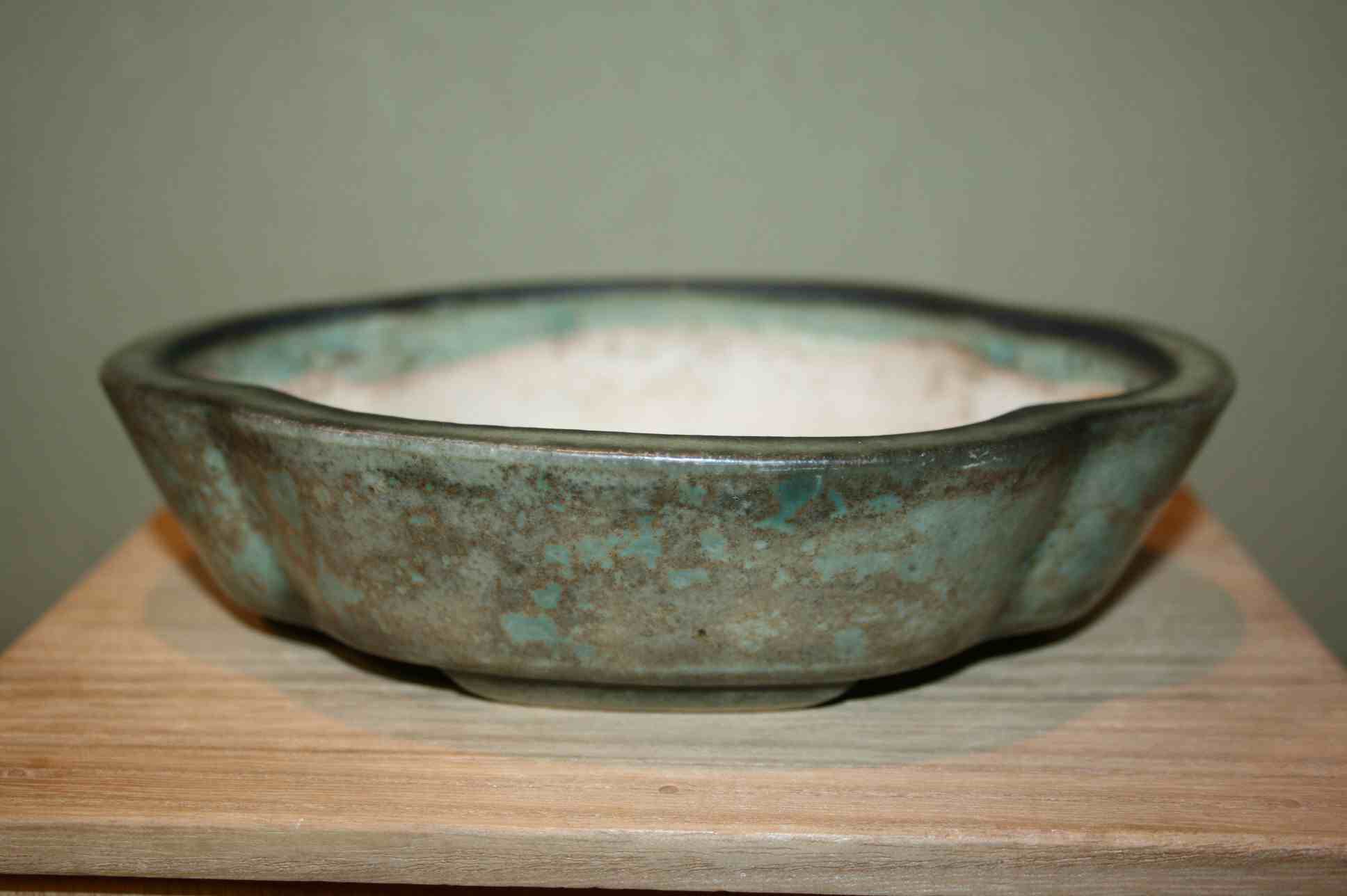
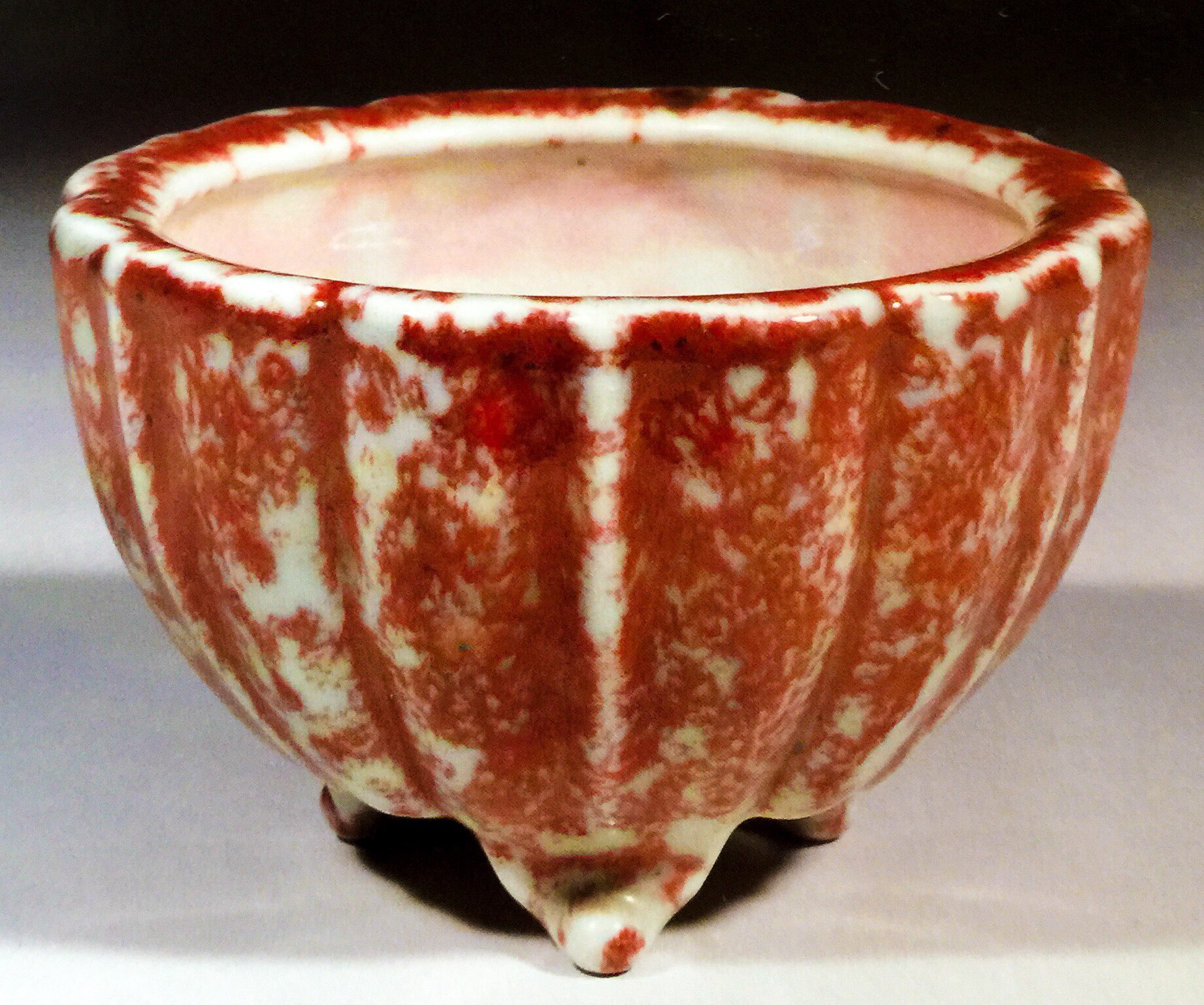
A very shallow oval from Heian Kouzan Jr. while the inset cut feet are masculine, this is a very feminine pot, with it’s shallow height, bottom indent band, and slightly sloping walls. 95/5•M/F

From the same family, Heian Kouzan Sr., here is a Rinka shape with fancy feet, soft kinyo glaze, and lip. While the height is masculine, everything else is elegant and feminine. Could still suit a powerful deciduous bunjin maybe. 90/10•F/M

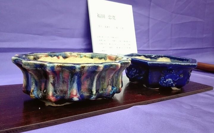
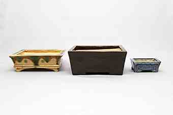
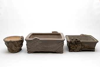
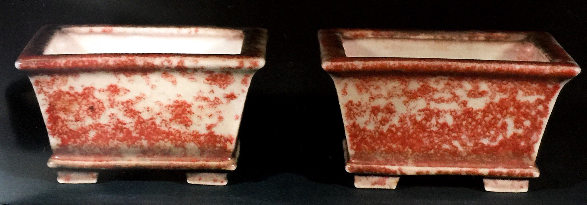
 A great pair of unglazed pieces showing why offset panels(as in the first piece), are thought to be masculine features, while recessed panels are considered feminine features.

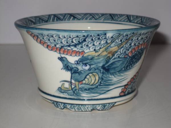
An illustration with an Ino Shukuho and a Doshita Keishin, respectively, on the difference between “incised corners”(sumi iri) which are feminine and “cut corners”(sumi kiri) which are masculine  It is a bit of a pet peeve of mine to see this these mislabeled as they’re very different in character.  It’s easy to see when you compare them side by side why the difference in gender is more than just convention.

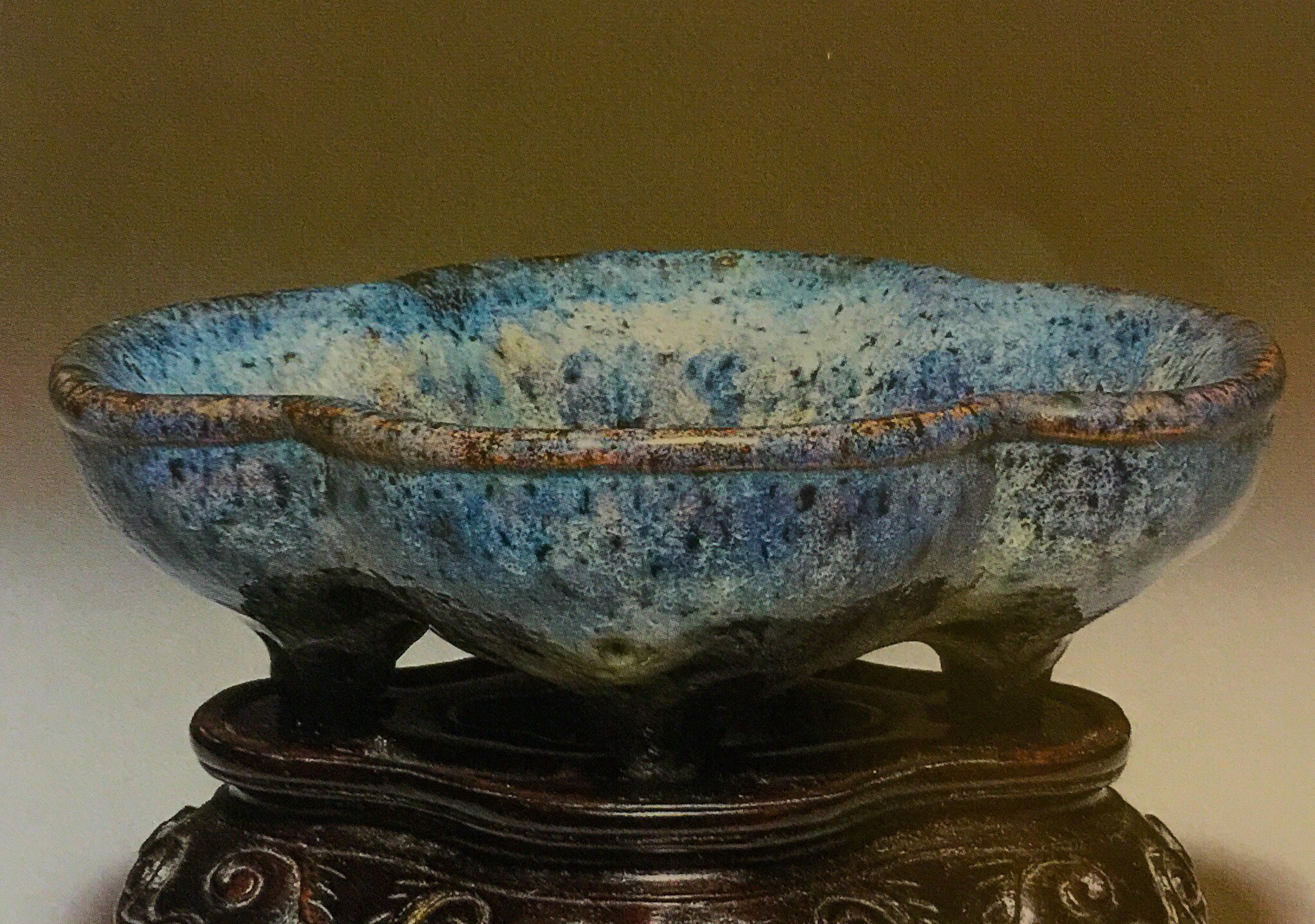
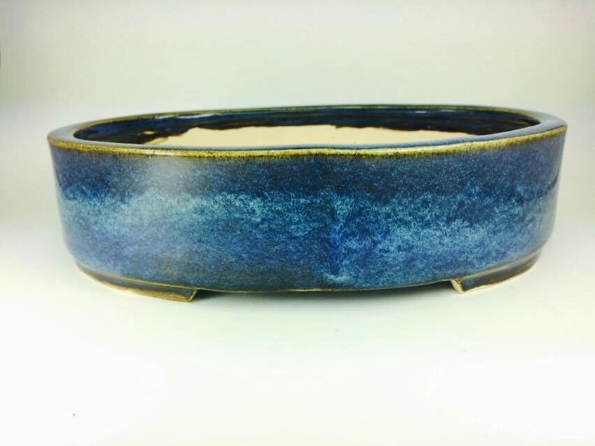
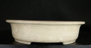
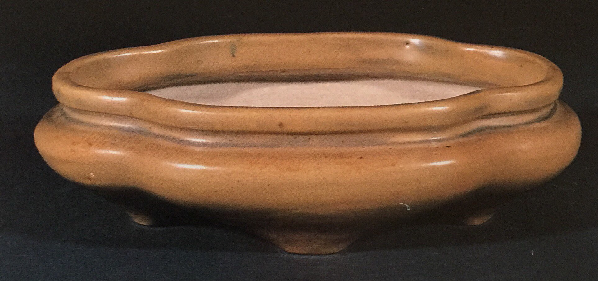
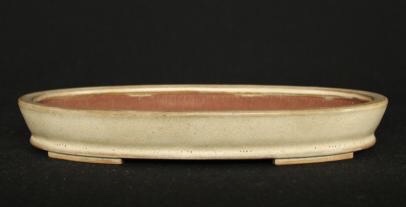
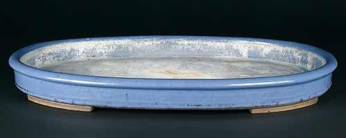
A classical very shallow feminine antique Chinese Kinyo container that was once likely a suiban. Simple, shallow, elegant, and very feminine. The masculine straight walls and cut feet would still suit a very powerful but elegant deciduous bonsai. 90/10•F/M, but a feminine pot nonetheless.

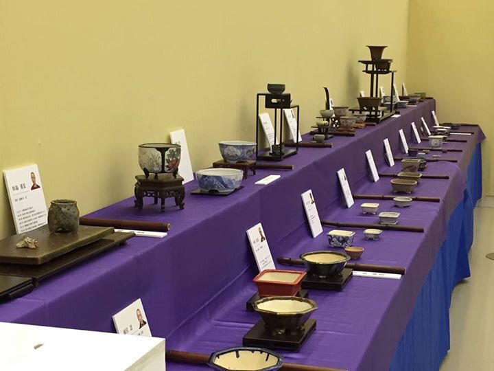
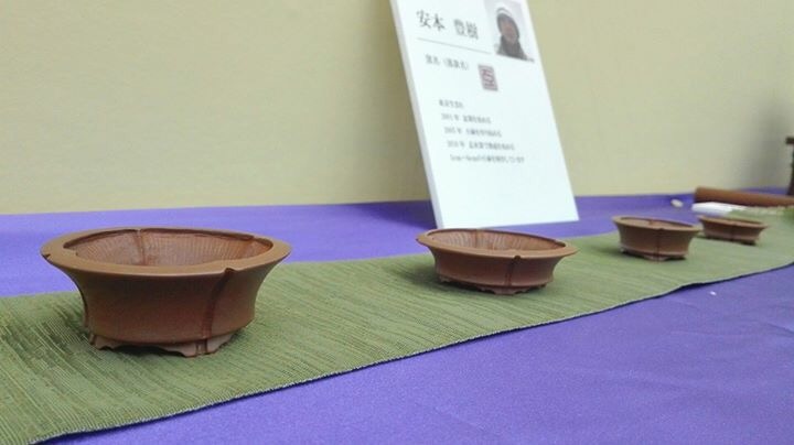
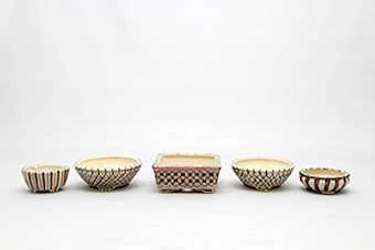
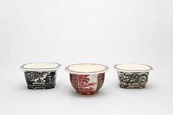
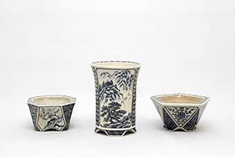
Now, in the interest of brevity, we’ll continue this discussion in another post. But before I let you leave, I’d like you to take a look at these bonsai, all different species, all with different qualities and attributes, all with varying levels of masculine and feminine character. All in one of 6 antique special Glazed Kinyo fukuro containers(Updated info I just learned!  Thanks Bill you’re a treasure!).

Think about how the owners considered the choice of this particular container.  Some of these trees are as much masculine as feminine, and vice versa.

I would love to hear your feedback and discussion on this post and it’s ideas, you can find the article shared in multiple Facebook groups, reply here, or send me your comments on Facebook messenger.

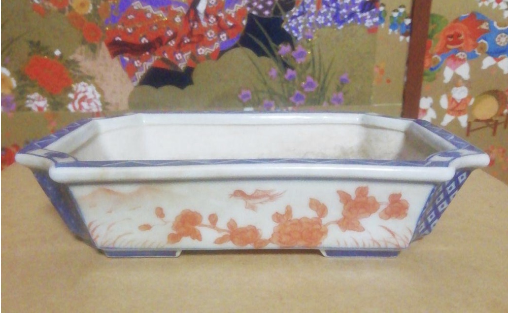
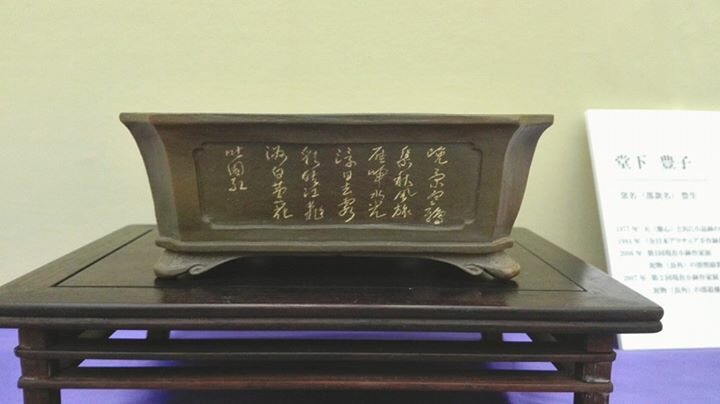
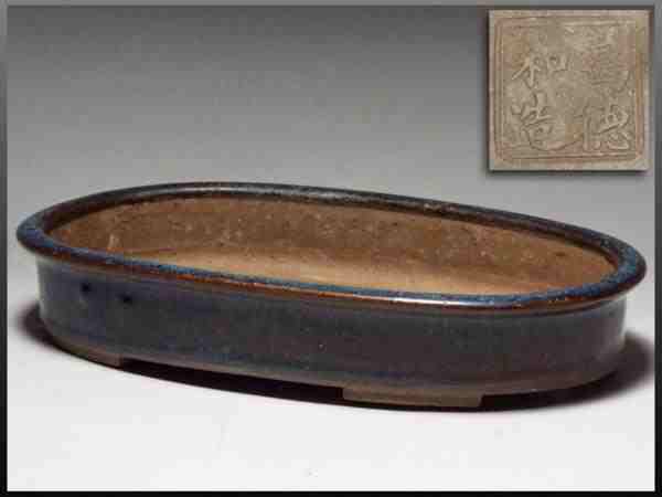
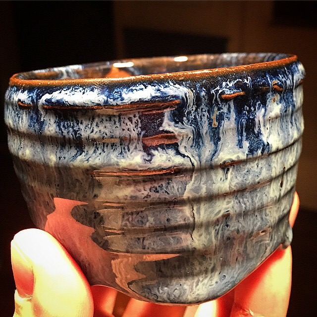
Postscript: this is still my favorite pot.

Posted in Famous and Antique Potters, Modern Potters, Pot Info, ID, Hanko, Books, ect., Trees | 4 Comments

New Beginnings and New Revisions

As many of you know, I’ve been faced with some major health issues over the last couple of years. After the coup de grace of those issues last week, I’ve decided to spend more time fixing some of the things on this site that should have been fixed a while ago.

First up, the Asian Marks database will be no more. Instead, it will be separated into 3 separate databases featuring Japanese, Chinese, and Tokoname marks. I’ve also hopefully improved the interface for mobile users and will be adding many, many more marks. The beta testing version of the Japanese Marks page is already up, so give it a look and messenger me on Facebook with feedback.

As of 1/16, the Chinese page beta is also now live.

Second, articles and blog posts will begin soon. Lots more in store now that the website is back awake. I hope the community I’ve come to love will enjoy it!

The Notorious MRB

Posted in Uncategorized | Leave a comment

Ogurayama, Part 2

Karahashi Homiyabi was born September 5, 1920, in Kyoto.  Before bonsai pottery, he helped with the family business making traditional Kyo-yaki ware.  He started his earnest apprenticeship as a potter/painter in 1970 under Heian Matsumoto, and gained his independence in 1975, whereupon he built a hybrid gas/electric kiln and took the potter name “Kiyoumine Ogurayama”.  Ogurayama entered his first big bonsai pottery exhibition, the National Masterpiece Kobachi, in 1981, and took the Grand Prize.  Since then, he’s won numerous awards and medals for his work.  He is now retired, and his son is the Ogurayama.

This is our second look at Ogurayama.  The first was 3 years to the day I started working on this article earlier this month: Ogurayama Part 1.

Ogurayama’s work and style are quite varied and impressive: Carved pieces, underglaze painting, over glaze enamel, and glazed containers are all excellent.  His painting work is an interesting mix of traditional Kyo-Yaki style and his own innovative pictorial style.  Very popular in the Japanese Shohin shows like Gafu Ten, very underrated for the quality, and at a great price point.

Now….on to the pots!

  Ogurayama creates some of the best winter scene painted containers I’ve seen, from any painter.  This piece is sublime, with just enough color to focus the attention on the figures crossing the bridge.  The demon feet are a great touch, and show his carving work in addition to excellent painting.
  A very nice figure painting sometsuke.  Very nicely detailed figures, and excellent patina.  Traditional Kyo-yaki arabesques, another showing excellent patina.
  A really unique piece.  The top a very highly detailed 5 color figure painting, and the base a gold overglaze enamel.  Astounding contrast.  A simple glazed cream oval with red accents.
  Another traditional style painting, of Ume in bloom.  The single offset bloom to the right of center creates an assymetry that makes the pot stand apart(and gives direction and flow to the painting).  A less detailed sometsuke figure piece than the previous examples.  More Spartan, with a great use of negative space and a clear story.
  An almost coral red glaze with cram accents.  Interesting form and the darkening of the glaze in the center process an interesting symmetry, complimenting the cut feet.Traditional Kyoto style geometrics and a mokko panel landscape.  Good patina on this piece.  An easily usable pot.
  Another very detailed figure painting.  There are two things about this pot that really stand out for me: the hole in the foot, which is a nice touch, and the figure pointing up and outward.  The latter provides flow and direction to the piece, and that his index finger just barely crosses the clearly defined line of the scene is fascinating.  I see it as almost spiritually metaphorical.  An abstract painting with Hiragana(ほ-ho).  Hiragana is a phonetic way of writing Japanese, more closely resembling our western writing than Kanji.  It is considered feminine in style and often used by poetesses.
  Two sides of a fascinatingly colored rectangle.  The upper seems like a Monet, the Lower calls to my mind Van Gogh.  Really interesting and unique style here.

Oribe glazed green and blue with demon feet.  Fantastic glaze and Clay work.
  Another really interesting container showing multiple levels of talent.  The indent corners, bottom sash, and clean lines show excellent clay work, the brilliant yellow shows Ogurayama’s glazing expertise, and the ken mokko shaped panel with go-sai landscape show his painting skill.  An excellent piece, with a great patina.  Another landscape rectangle.  This piece is highly detailed, and the color variations Ogurayama pulls from the sometsuke are astounding.
This piece throws me for a loop.  Sitting under a tree, we are looking out on a landscape, rather than looking in.  Like the finger crossing the frame in the previous piece, this shows something entirely different and more artistic in meaning and purpose than we see from most painters of bonsai containers.  Very different….
 A really excellent and cartoonish winter scene with good patina, on a soft cornered rectangle with half cloud feet.  Lovely.  Enough said.

  Overglaze enamel birds over waves.  The black on Orange is a striking combination.  We’ll finish up our second look at the work of Ogurayama with this extremely odd cut corner ruri rectangle….with what I believe to be are the classical frolicking children…but very oddly rendered.  The overglaze painting calls to my mind the appearance of chalk drawn on the street, by children, of children(or maybe astronauts).  Another meta piece.
 From a few other angles, you can see the nicely carved demon feet glazed in gold enamel.  An truly outstanding piece, from a woefully underrated master of Bonsai Ceramics.

Thanks for reading!  Stay tuned for updates tomorrow on upcoming lectures and locations, and take a look at the updated “Services” page under the menu bar!

Posted in Uncategorized | 3 Comments

The 11th Annual Shohin Pottery Competition (2)

There were many other notable artists and favorites in this year’s exhibition who didn’t win awards.  Let’s take a look at a few I found interesting.


 My friend Ruban Yu of Taiwan entered a nice set of 3 painted containers, showing a nice diversity of form and interesting style to the paintings that is every bit unique. 

   Ruban’s containers pair very well with bonsai, I’ve seen some fantastic examples from Taiwan.  That’s perhaps the best Fukien Tea Shohin I’ve seen, and I’m quite envious of the second tree, as well, a collected Taiwan Native, Breynia Officianalis.   Give his website a visit to see more of his work here: Ruban Yu.

  One of the three students of Bushuan in this year’s competition, Shunhou presented three unglazed pieces.  Excellent clay work is apparent, a bit more diversity of form and I think he would have taken a prize.    

 The entry from another blog favorite and renowned Japanese potter Hayashi Tyukan.  I was quite surprised this entry didn’t take a prize.  For more on this artist, there’s an article in the TOC.  That Ken-Rinka Shape round is absolutely breathtaking. 

 The entry from renowned Kyoto potter Koto Chukan.  Very rarely do I say anything negative about the containers I showcase here, but this year, I was a bit disappointed with Chukan’s entry….. 

   A couple of other pieces from Koto Chukan, to illustrate my disappointment.  A trio of nicely carved and glazed pieces from friend of the blog Kiyoshi Koiwai.  Very excellent footwork and very nice geometric carvings as well.
  A three piece entry from former Ishida Shoseki student Shosui.  These are some of the best detailed containers I’ve seen from this artist. A 3 piece glazed entry with relief carvings from friend Tani Ranzan.  Ranzan has an incredible diversity of talent, and excels at carvings, paintings, and clay work.   

 The 3rd Bushuan student to be accepted to the exhibition, this 3 piece offering comes from Michiko Jinbo, wife of glazed category winner Hiyashi Jinbo(Jinbe).  One can really see the influence of her teacher in the container on the left….. 

 Bushuan from my collection showing a very similiar glaze style and form. 

  A really nice trio of painted containers from Kenji Kobayashi, who took silver in the category in 2014.  Nicely detailed and excellent clay work. A trio of painted containers from Yamachi(山ち), Tomoko Ishikawa.  Excellent detail and good variety of painting and shape.
  The entry from Tomoyoshi Tamura, the brother of the the silver award in the painted category.  Very interesting glazes and painting.


 Last up from the exhibition proper, we have the entries from the husband and wife Doshitas(Doshita Keishin and Doshita Housei, respectively).  Keishin and Housei do marvelous work.  Her paintings are excellent and highly detailed, while his unglazed containers show fantastic clay work and a rare talent for magnificent calligraphy.  I think it likely these two pottery pros are the reason top honors are no longer given back to back, as both won top honors in their respective categories in the first couple of Exhibitions.  Look for full articles on them in the coming weeks. 

 In addition to the Container exhibition proper, there were two pottery displays in the Gafu Ten that I thought were worth a look.  The above 7 point display features 6 containers from Heian Tofukuji, and a small painted container from Tsukinowa Yusen.  Great variety of form, depth, texture, and shape.    The second pottery display I enjoyed was a 7 point featuring all works by Ichinokura Sekisyu.  Again, good diversity of shape, but I would have liked to see at least 1 each of the unglazed and glazed containers Sekisyu also excelled at creating.

If you’d like to read more and see more of the The Shohin Bonsai Pottery Exhibitions, check the Table of Contents for my reports on previous shows, and also visit 2016 Kobachi for the other entries from this year!

Thanks again for reading!  

Posted in Famous and Antique Potters, Modern Potters | 2 Comments

The 11th Annual Shohin Pottery Competition (1)

Every year I look forward to Gafu Ten and the results of the big pottery competition and exhibition that is held there each year.  For articles on the previous exhibitions, click the over to the Table of Contents page under the menu bar.

Lots to talk about from this year’s exhibition, with many images, so I’ll be separating it into two posts.  First up, the winners, and the entries from last year’s gold medalists.

   
 Overviews of the exhibition.

Now, on to the pots!

Unglazed Containers


   The Gold medalists for the previous year aren’t eligible for prizes(nor are those who have won top honors more than a couple of times), but they are always invited to display in the following year. This was the entry from British Potter Andrew Pearson, of Stone Monkey Ceramics, who took gold last year. This year’s entry features real silver rivets. I was quite impressed with them. Very Classical but also very innovative. Extraordinarily clean lines, reminiscent of “The Razor” Heian Kouzan. Well done Andy. 
  Gold medal in the unglazed category went to Takashi Ono(大矢 忠), who won the category also in 2009 and 2011.  His carvings are some of the best of any bonsai potter of all time, rivaling the greats like Suruga Yamashou and Zeshin.  


  The Silver award went to Sugiahima Shigehiro, who goes by the potter name Hiroshi(宏).  An interesting trio of containers with good form and ash finish.  Hiroshi trained in the past with well known Shigaraki potters Hikari and Yamafutoshien.
  

 The bronze medal this year for unglazed containers went to Toyoki Yasumoto, who presented a series of 4 mini-bonsai containers.  Very excellent form for such small pieces.
Glazed Containers

   The gold award for Glazed pottery went to one of 3 students of blog favorite Fukuda Shigeru(Bushuan) who exhibited in this show. The artist is Kyuji Jinbo , who goes by the names Jinkozan (神久山) or Jinbe(じんべ).  He won the silver award in the category last year.  Excellent forms and glazes, you can certainly see the influence of his Teacher, of who Jinbe remarks that he taught him “the Joy of the flowerpot”.
 Silver medalist for glazed containers in this year’s show went to blog favorite Shunka Seizan. For the past articles on Shunka Seizan, click his name.  As usual, fantastic glazes, and good diversityof form for single block carved containers.

 After the show, I was fortunate enough to add one of the three winning containers to my collection.  An excellent example of Sango Yu(Coral Red Glaze).
   The bronze award for glazed containers went to Hiroshi Hirabayashi, for a quartet of glaze/enamel painted mini containers(the painted container category is strictly for landscape and figure paintings).  He studies bonsai at Yamato-en.  Good geometric designs and multiple shapes.
 Last years’ winner for glazed containers, Shinobu(who also took the Gold for unglazed containers in 2014), presented a trio of Hakkaku(octagon) containers with cloud feet.  Both glazed and unglazed, and all 3 very nice.  Formerly a hobby potter, Shinobu is now in full production, and in addition to Glazed and Unglazed containers, makes excellent tenpai.  

 Shinobu award winning glazed container from 2015. Shinobu Hut Tenpai and moss shitakusa from my collection.

Painted Containers

   Gold in painted containers this year was awarded to Yokotani Toshihide, formerly known as Shuzan, now working under the name Shunhou(俊峯). Shunhou is a former apprentice of Owari Yuhou, who I’ve featured on the blog before.  He also won bronze in 2015 and silver in 2014.

   
 A couple of other examples of Shunhou’s work.

  The silver award in painted containers went to Shintaro Tamura, who goes by the trade name Matsutake.  His father(Takeo Tamura) is a well-known collector of containers, and his brother also exhibited in this show.  Great variety of shapes, very clean clay work.  And disarmingly simple but lovely paintings.  Shibui.  Bronze this year went to Kyogoku Shiho.  If you check the Table of Contents there’s an older article about this painter.  Excellent details and classical styles.  A sharp contrast to the “less is more”Aesthetic of the silver award winner above! 
   
Last year’s winner in the category, Yamada Shigetoshi(Shun) presented three containers showing excellently detailed paintings and a good diversity of form.

  And last of all, the special exhibition from Ito Gekkou.  Gekkou has won enough awards, of course, so these were for display only.  Great to see his current style, and how it’s changed so much from earlier works.
Thanks for Reading!  Stay Tuned!  Tomorrow I’ll post Part 2, looking at the other entrants into the exhibition!

Posted in Modern Potters, My Personal Collection | 4 Comments

Classical Glazes 1, the many faces of Namako

Dating to the Kowatari era, Namako(Nuh-mah-ko), or Sea Cucumber glaze, is one of many Classical Glazes still in use today.  Along with Kinyo(baby blue), Ki(Yellow), Tenmoku, and various Canton glazes, Namako is one of those glazes every Contemporary Japanese artist has their own version and spin on.  

Namako has many characteristics of Chun Blue glazes(thanks Steve) another Classical Chinese glaze that saw its peak in the 11-15th centuries.  Namako is characteristically dark blue, with notes of browns and white flecks.  Unlike Kinyo and other blue glazes, Namako gets its blue coloration from “spherules of immiscible glass floating in the larger glass matrix. These are of the appropriate size to scatter blue light and not other wavelengths thus making the glaze appear blue to your eye.” Traditional Namako includes things like Bone Ash(Calcium Phosphate) Rice-Straw ash, and Feldspar.  The white pattern in the blue is often “Hare’s Fur”, common to Tenmoku and Namako.

           Sea Cucumber or Sea Slug….you can see where the name comes from!

Today we’ll take a look at the many and varied faces of Namako, both from antiquity and the modern era.  

Now, on to the pots!  

Antique Chinese Namako

   Classical Jingasa(Old Hat) shape with Namako.  Like many Namako glazes, the white mottling is night-sky-like and shows great depth.

  A typical Namako glazed rectangle, showing brown at the corners and angles.  Generally, the darker the clay, the more blue will show, and the lighter, less.Brown Namako oval.  The blue shows in the bottom of the glaze.  
  Round Namako with lip, showing significant white.  A subtle Namako rectangle.
  Darker Namako oval with a good balance of white and blue.  A really excellent Namako with soft inner lip(Uchi Buchi, how fun is that to say?) and great depth.
  Another Brown Namako.  This is an excellent example of why it is often difficult to date Namako, as patina is difficult to see.

 Nakawatari Namako from Yixing.  Deep, rich blue and brown at the angles.  Namako round showing the desirable Hare’s Fur pattern.  The quintessential Hare’s Fur pattern.  Namako over Tenmoku.

  Namako lipped rectangle.  Deep blue with brown at the angles and very light white accents.

  Kowatari Canton Namako.  Canton Namako is quite rare, and shows more whites and brighter blues, along with a different type of pattern.
  Another Kowatari Canton Namako.  The brighter blues and difference In pattern can clearly be seen on this suiban.

Japanese Namako

While old Chinese Namako was very much shibui(complex but simple and subtle), contemporary Japanese Namako often tends towards hade(indulgently complex, wild).

Heian  Kouzan, Later edition Namako Rectangle with double incised corners.

 Harumatsu Namako Suiban.

Suishoen, Tokoname.  Namako soft cornered Rectangle. 
  Youzan, Tokoname.  Significant whites and running hare’s fur make Youzan Namako quite unique.Hidemi Shuhou, Tokoname.  Brighter blues and running whites are more typical of contemporary Japanese Namako.  

  Aiba Kouyou.  Crazy Namako.    Bushuan.  Unlike classical Namako, which is a single glaze, many contemporary artists use multiple glazes for a Namako effect.  Taisho Bachi, Japanese Namako(1911-1926).  Most Taisho era Japanese bonsai containers are copies of Antique Chinese glazes, and Namako are common.  They never show the same level of depth as Antique Chinese Namako.

  Aiba Kouyou, Tokoname.  Koyo has 3 versions of Namako, this is my favorite of the three. Reihou, Tokoname.  A very classical style Namako, suiting Reiho’s classical style.  Reihou, Tokoname.  Another very Classical style Namako.
 Double Glazed, Namako over Oribe from Gyoumu.  Contemporary artists frequently layer Namako over other glazes, Tenmoku being the most common.

  As Classical bonsai pottery becomes better known in the west, more artists are using these glazes.  Here is a really nice Namako from Roy Minarai of South Carolina.
 Another excellent Namako style glaze from American Stephanie Walker, showing great depth and some sweet foot drips. 

 American Namako from Tyler Johnson, showing significant running and excellent depth.

I hope you’ve enjoyed this look at classical and contemporary Namako!

  I hope to see everyone this coming September in Rochester, where I will be giving two lectures on Bonsai Containers.  It’s an honor to be invited, and I’m looking forward to seeing everyone!
Thanks for reading! 

Posted in Famous and Antique Potters, Modern Potters | 3 Comments

Shosekis! 

With Heike Van Gunst

Shosekis! (Part 3 of the Bang for your Buck series)

Ishida Shoseki

Ishida Shoseki was born in 1925, but didn’t start to create bonsai containers until 1969.  At the age of 50, she first trained under a professional potter, at wheel throwing,  under Bunsho, in Imari, and subsequently went on to study painting under Miyazaki Tosato.

Her style combines the best of classical Imari style figure painting and geometrics with a distinctly feminine touch.  She passed away in 2005, at the height of her popularity amoung Shohin enthusiasts.  

  An oval porcelain pot painted with landscape motifs in blue and green.
  An excellent figurative Geometric dragon.  A round piece with highly detailed geometrics and cloud panel landscape.  A hexagonal porcelain pot with landscape motifs and geometric patterns. On the feet of the pot there are painted flowers.  A round pot painted in blue. Two pines stand on a cliff above the sea. Below the cliff thow little boats are sailing along. In the background there are rocky islands.  Frogs like those painted on this round porcelain pot are a motif that Ishida Shoseki has used quite often, from the Chojugiga.  A rectangular porcelain pot with landscape paintings and geometrics.  The landscape motifs in the fan-shaped picture frames are painted in five colours.  Photo courtesy Yorozuen

Children motifs are popular with both Shosekis.

 A colourful flower pattern is painted on this round mame pot.  

A porcelain unpainted container with cut feet and lip.   

Blue glazed taiko(drum) with double bands of rivets.  Figurative parrot and palm tree.   

A landscape with hares is painted with black glaze colour on the light blue glazed porcelain pot.  The painting is by Daisuke Sano, the pot by Shoseki.  There is a frog motif on the other side of the pot.  Chop mark of Ishida Shoseki, signature of Sano, later edition signature.     A cascade pot with blue landscape painting. The composition and the use of free space is as remarkable as the vivid expression of the motif.

Yuki Shoseki

She was born in Tokyo in 1948, and in 1988 began her apprenticeship under Ishida Shoseki, after marrying her eldest son.  In 2005, she inherited the Shoseki name becoming the second generation Shoseki.  

Like her mother-in-law, and teacher, she is excellent with figure paintings, Imari style geometrics, and landscapes.   

  9 containers by Yuki in a variety of styles, showing the diversity of this artist.  Photo courtesy of German Gomez Soler.

  Rectangle with akae geometrics and landscape panel.
  Sometsuke geometrics.  Chojugiga.
  Soft rectangle with landscape.  Frolicking child in red.
  5 color children surrounded by Sometsuke geometrics.  Dragon and geometric details.
  Interesting rope border fan panel landscape and geometrics.  Landscape panel and geometrics.
  5 color Landscape hut on round.  Cricket panel and geometrics.
  An impressively detailed panel landscape and geometrics.  Frolicking children in 5 color.
 A cooperative effort from Yuki Shoseki and Shibakatsu.

I hope you’ve enjoyed this look at the painted containers of Ishida and Yuki Shoseki.  

Take a minute and check out Heike Van Gunst’s excellent sister article to this one, at 
Bonsaipots.net, Shosekis

Stay tuned, plenty of great articles coming out soon!   Thanks for reading!

Posted in Uncategorized | 1 Comment

Inoue Ryosai

After a long summer and fall hiatus while I’ve been actually DOING bonsai, I’m back this week with the first of several articles to be published before the end of the year.  Thanks for being patient and sticking around!

Third Generation Inoue Ryosai(Inoue Ryotaro) was born September 4, 1888 in Asakusa, Tokyo, to the eldest son of the founder of the kiln.  The kiln was originally founded in the Edo period, and the family is descended from a long line of potters in the Owari/Seto clan.

He began his study of ceramics at the age of 17, and studied under “the father of modern Japanese ceramics”, Itaya Hazan.  In 1914, he inherited the family kiln and name, and moved to Yokohama, and built a new kiln.  The kiln was destroyed in 1923 in the Great Kanto earthquake, and he constructed a new, larger noborigama(climbing kiln) that still stands today, almost 11 meters tall.  It is “a mere 10 minute bike ride” from the kiln of another of the all time greats of Japanese Ceramics, Makuzu Kozan.

Ryosai specialized in export pottery for the high class Chinese and European markets, so pieces(like bonsai containers) for the Japanese market are exceedingly rare and culturally precious.  Ryosai won a host of prizes and awards in his lifetime, including the Emperors Prize in 1928, admission to the Japanese Acadamy of Fine Arts, and the rare designation as a living Cultural Treasure.  

His pieces are varied in style, and run the gamut from Unglazed to Glazed, to painted, carved and even enameled.  Truly an exceptional talent in all forms of ceramic art.

He passed away February 6, 1971. 

  A really fantastically glazed rectangle with cut feet and white clay.  One of the few I’ve ever seen up for sale.  Another wonderful glazed piece.  Very contemporary in both style and glaze, this is what makes the truly great artists: timelessness.    Another glazed piece, this one a soft mokko Showing an excellent patina.    It wouldn’t be fare to show Ryosai’s work without a few Non-bonsai related items.  A love crackle with just a splash of color.  A really striking kinyo oval.  Note the full coverage of the feet and the total lack of patina.  Truly a valuable item.  One of Ryosai’s painted sometsuke pieces. Taken from the blog of Haruyoshi San.  Charming and whimsical.

    A famous and outstanding overglaze enameled piece in black, red, and gold.  The detail is stunning.  Absolutely breathtaking piece.
  Another of Ryosai’s non-bonsai pieces.  Had to include this one, for the striking carving.  A glazed rectangle in a striped and rich green.  Great depth to the glaze.

An unglazed oval.  The clay color, patina, and form are striking.    One of Ryosai’s specialties was Flambé glaze, also known as Oribe red or copper red.  Under certain conditions(oxidation at 1220C) Oribe glazed are green, under others, they’re red.  The level of red in this woven glaze is simply outstanding.
  A six sided pot with a soba noodle glaze.  Great depth and fantastic, uniform fine oil droplets.

  Another painter container, this one painted with a rustic geometric band.  Charming and whimsical.
  Another Flambé glazed piece, in an antique mirror shape.  There’s just not much to say here.  It’s breathtaking.  Masterpiece. 

 A rich and deep green glazed rectangle with lip and bottom band.  Marvelous patina.  Simple, classical, lovely.

 A painted cascade container in cobalt-blue showing some fancy feet and wonderful patina.  Last up for the flambé/Oribe-red containers, is this matched set of cut foot squares with lip.  Simply outstanding.  No potter I’m aware of does copper reds quite as well as Ryosai(Imaoka does a pretty good version though).

  A simple and elegant celadon crackle in antique mirror shape.  

Six sided container with triangle feet in classical Oribe with painted horse.  Elegant.   Another painted container, in sometsuke.  A simple landscape and charming painting.

  And we’ll finish up our look at Inoue Ryosai with this fantastic mokko in Kouka-Yu(peach glaze).  Lovely, uniform color, striking in its simplicity and perfect form.
I hope you’ve enjoyed this look at the masterpiece containers of Inoue Ryosai.

Stay tuned, I have several more articles coming up on the horizon, including a Co-op article with Heike Van Gunst of Germany (who is also translating my articles to German for Peter Krebs’ Bonsaipots.net site) on Ishida and Yuuki Shoseki, several articles in series on antique Chinese glazes and clay types, and more!

Thanks for reading!

Posted in Uncategorized | Leave a comment